A Simple Online Directory: 6 Key Features to Include for User-Friendliness

Generating summary...
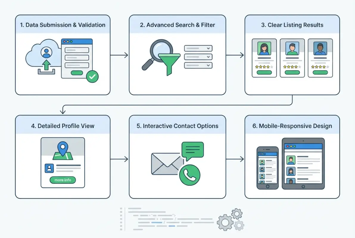
Building an online directory sounds simple on paper—you need a searchable database, listings, maybe some filters, and you’re done. But if you’ve ever tried to actually use a poorly designed directory, you know the frustration: clunky search boxes that return nothing useful, listings with outdated phone numbers, and navigation that feels like wandering through a maze blindfolded. The truth is, a directory lives or dies based on how easily people can find what they’re looking for. If your users can’t discover relevant listings in seconds, they’ll bounce—and they won’t come back.
What separates a thriving directory from a digital ghost town? It’s not about cramming in every possible feature or building something flashy. Success comes down to six core capabilities that work together seamlessly: powerful search that actually understands what users want, listings packed with the right information, trust signals that make people confident in what they find, mobile-friendly design that works on any device, clear content structure that doesn’t confuse anyone, and a submission process that doesn’t make listing owners want to tear their hair out. Get these fundamentals right, and everything else becomes easier.
TL;DR – Quick Takeaways
- Search is your directory’s backbone – Instant feedback, smart filters, and location awareness separate usable directories from frustrating ones
- Rich listings drive decisions – Comprehensive, structured information with photos and verified details builds user confidence
- Trust signals aren’t optional – Reviews, ratings, and moderation turn casual browsers into committed users
- Mobile-first isn’t a buzzword – Most directory searches happen on phones; responsive design and accessibility compliance are non-negotiable
- Easy submissions fuel growth – Simple, clear listing forms and management tools keep your database fresh and expanding
Feature 1 — Powerful, Yet Simple Search
The search bar is the front door to your directory. When someone lands on your site, they’re not there to browse aimlessly—they have a specific need, whether it’s finding a plumber in Brooklyn or discovering vegan restaurants near their office. Your search interface needs to read their mind (well, almost). This means prominent placement, ideally above the fold where nobody can miss it, with instant visual feedback the moment they start typing.

Clear Search UX
Autosuggest isn’t just a nice-to-have feature anymore; it’s expected. As users type “pet groom” they should see “pet grooming services” appear before they finish. This immediate validation tells them they’re on the right track and saves precious seconds. The search bar itself should be large enough to tap comfortably on mobile (minimum 44×44 pixels according to accessibility guidelines) and use placeholder text that actually helps—”Search by business name, category, or location” beats the generic “Search…” every time.
I’ve seen directories where the search box is tucked into a sidebar or hidden behind a hamburger menu. That’s like putting the entrance to your store in an alley. Place it center stage, make it obvious, and watch your engagement metrics climb. The feedback loop matters too—if someone searches for “coffee downtown” and gets zero results, show them close matches like “coffee shops” or “cafes in nearby areas” instead of a blank page with “No results found.”
Helpful Filters and Facets
Filters transform a flood of results into a manageable stream. Location radius filters (within 5 miles, 10 miles, 25 miles) help users narrow by geography. Category checkboxes let them specify exactly what type of business they want. Price range sliders work beautifully for service directories where cost matters. Operating hours filters (“Open now”, “Open on weekends”) solve real problems—nobody wants to discover their perfect restaurant is closed on Mondays when they’re planning a Monday dinner.
Rating filters deserve special mention. A simple “4 stars and up” checkbox can cut through noise instantly. Just make sure you’re transparent about how ratings work—unverified reviews that anyone can submit have less weight than verified customer feedback, and users appreciate knowing the difference when you build online directory website attracts visitors.
Locality-Aware Results and Maps
Map integration isn’t optional for location-based directories. The ability to toggle between list view and map view gives users choice—some people think geographically and want to see pin clusters, others prefer scanning text listings. Distance indicators (“2.3 miles away”) provide context that pure addresses can’t match. When someone searches from their phone, using their GPS location to automatically sort results by proximity feels like magic.
The technical implementation matters here. Loading a map should never block the rest of your page from rendering. Lazy-load the map component after critical content appears, and make sure pins are clustered when zoomed out—nobody wants to see 500 overlapping markers creating an unusable blob of icons.
Search Performance Guidelines
Speed kills (in a good way). Search results that take more than 2 seconds to appear feel broken. Index your database properly—full-text search indexes on business names, descriptions, and categories are table stakes. Cache popular queries (think “pizza” or “dentist”) to serve frequent searches instantly. If your directory grows beyond a few thousand listings, consider dedicated search solutions like Elasticsearch or Algolia that handle complex queries without breaking a sweat.
Progressive enhancement helps here too. Show basic results immediately while smarter features (like map pins or review snippets) load in the background. Users get instant gratification from seeing something appear, then appreciate the enhanced details as they load.
Feature 2 — Rich, Structured Listings
Listings are the meat of your directory. If search is the front door, listings are the rooms people actually spend time in. A skeletal listing with just a name and phone number wastes everyone’s time, yours and theirs. Rich listings answer the questions bouncing around in users’ heads: What do they offer? Where are they located? When are they open? What do other people think about them? How much does it cost?
Comprehensive Listing Schema
Start with the essentials: business name, primary category, full description (not a one-liner), complete address, phone number that’s click-to-call on mobile, email, website link, and operating hours for every day of the week. Then layer on the differentiators: price level indicators ($ to $$$$), photo galleries, videos if relevant, key attributes (wheelchair accessible, parking available, outdoor seating), and social media links.
Consistency across listings creates trust. When every listing follows the same template, users develop pattern recognition—they know where to look for hours, where to find reviews, where the photo gallery lives. Breaking that pattern disrupts the flow and creates friction, much like when you add business to lawyers directory platforms that maintain strict formatting.
Visual Clarity and Hierarchy
Typography matters more than most people think. Clear heading hierarchy (business name in large text, category beneath in smaller gray text, then description) guides the eye naturally. Scannable bullet points work better than dense paragraphs for features and amenities. Thumbnail galleries with click-to-expand functionality let users preview visuals without overwhelming the page.
White space isn’t wasted space—it’s breathing room. Cramming information into every pixel creates cognitive overload. Strategic padding and margins make listings easier to process. Use consistent colors for action elements (blue for links, green for “open now” status, red for warnings about outdated info).
| Information Type | Essential Fields | Enhanced Fields |
|---|---|---|
| Contact | Phone, Address, Website | Email, Social links, Booking URL |
| Operational | Hours, Location | Holiday hours, Multiple locations |
| Visual | Logo, 3-5 photos | Video tour, 360° views, Menu PDFs |
| Trust | Reviews, Ratings | Verified badge, Awards, Certifications |
Reliability and Freshness
Nothing erodes trust faster than outdated information. When someone calls a number that’s been disconnected or drives to a location that closed six months ago, they blame your directory (not the business that failed to update). Build mechanisms for regular verification—automated email reminders to business owners quarterly, community reporting tools for users to flag problems, and staff reviews of high-traffic listings.
Display last-updated timestamps on listings. It’s a subtle trust signal that shows you care about accuracy. “Updated 2 weeks ago” feels current; silence makes users wonder if the information is from five years ago.
Rich Media Support
Photos aren’t decorative—they’re decision drivers. Restaurant listings without food photos convert at a fraction of the rate of those with mouth-watering galleries. Service businesses benefit from showing their team, workspace, or completed projects. Compress images properly (WebP format with fallbacks saves bandwidth), use descriptive alt text for accessibility, and implement lazy loading so a listing with 20 photos doesn’t kill page load time.
Videos add dimension but require careful handling. A 30-second clip showing the inside of a venue or a service in action works great. A five-minute promotional video that auto-plays will chase users away. Host videos externally (YouTube embeds are fine) to avoid hosting headaches and bandwidth costs.
Feature 3 — Clear, Trust-Building User Interactions
Trust is currency in the directory business. Why should someone believe your listings are accurate, complete, and worth their time? The answer lies in transparent interactions—reviews, ratings, verification systems, and responsive moderation that shows you’re actively maintaining quality.
User Ratings and Reviews
Simple rating systems work best. Five-star scales are universally understood; anything more complex (10-point scales, multiple rating dimensions) creates decision paralysis for reviewers. Make leaving a review genuinely easy—after someone clicks to call a business or visits their website, prompt them to rate their experience. Not immediately (that’s annoying), but in a follow-up email a day or two later.
Review moderation balances openness with quality. You don’t want to censor genuine criticism, but spam reviews, obvious fakes, and reviews violating clear content policies (profanity, personal attacks, unrelated rants) should be removed. Display your moderation policy transparently so users understand the rules.
Response functionality matters too. Allowing business owners to respond to reviews (both positive and negative) creates dialogue and shows businesses are engaged. A thoughtful response to a negative review often impresses readers more than a dozen glowing testimonials.
Save, Compare, and Bookmark
Decision-making rarely happens in one session. Someone researching “family law attorneys” might browse ten listings across several days before choosing. Give them tools to save favorites—either through user accounts or persistent browser cookies if account creation feels like too much friction for your audience.
Comparison features shine when users are evaluating similar options. A side-by-side view showing hours, price range, ratings, and key features for three saved listings helps people make informed choices. This works particularly well for service directories where specs and credentials matter (lawyers, contractors, medical providers).
Reporting and Flagging
Empower your community to maintain quality. A simple “Report a problem” button on every listing gives users a channel to flag outdated info, inappropriate content, or suspected spam. The key is responding to these reports promptly—if users submit flags that disappear into a void with no action, they’ll stop helping.
Be specific about what users should report. Generic “report” buttons leave people guessing; clear options like “Business has closed”, “Incorrect phone number”, “Spam or fake listing”, or “Inappropriate content” guide better reporting and make triaging easier for you.
Moderation and Quality Controls
Light-touch moderation beats heavy-handed control. Automatically approving most submissions while flagging suspicious patterns (duplicate addresses, keyword-stuffed descriptions, excessive promotional language) for manual review keeps your queue manageable without creating bottlenecks. Pre-screening new listings from first-time submitters prevents spam waves while regular contributors earn automatic approval privileges.
Document your quality standards publicly. When business owners know you reject listings with all-caps titles or block promotional language in the wrong fields, they submit cleaner content upfront. This saves everyone time and reduces frustration.
Feature 4 — Accessible, Mobile-First Design
Let’s be honest—most of your traffic is coming from phones. Pretending desktop matters more than mobile is like optimizing for Internet Explorer in modern web development. Mobile-first design isn’t about cramming your desktop site onto a smaller screen; it’s about rethinking the entire experience around touch interfaces, varying connectivity, and different usage contexts (someone searching while walking down the street versus sitting at a desk).

Responsive, Mobile-First Layout
Fluid grids that adapt to screen size form the foundation. Content should reflow naturally whether someone’s viewing on a 320px phone, a tablet, or a 4K monitor. Touch targets need generous sizing—those tiny desktop links that work fine with a mouse cursor become infuriating when you’re trying to tap them with a thumb on a swaying subway.
Typography deserves special attention on mobile. Text that’s readable on a 27-inch monitor becomes microscopic on a phone. Use relative units (em or rem) instead of fixed pixels, maintain reasonable contrast ratios (WCAG recommends 4.5:1 for normal text), and never, ever make users pinch-zoom to read body content.
Navigation patterns matter. Hamburger menus work for secondary navigation, but your core functions (search, categories, account) should be immediately accessible. Bottom navigation bars on mobile put important actions within thumb reach—much better ergonomics than forcing users to stretch to the top of the screen constantly, particularly when you’re trying to build online directory website attracts visitors on mobile devices.
Accessibility as a Design Constraint
WCAG 2.1 Level AA compliance isn’t just about avoiding lawsuits (though that matters); it’s about serving everyone who wants to use your directory. Alt text on images helps screen readers convey visual information. Semantic HTML (proper heading hierarchy, meaningful link text, labeled form fields) creates structure that assistive technologies can parse. Keyboard navigation ensures people who can’t use a mouse can still browse listings and submit forms.
Color shouldn’t be the only way you convey information. If “open now” is green and “closed” is red, also use text labels or icons—about 8% of men have some form of color blindness. Form validation that only shows red borders on invalid fields fails for many users; add clear error messages too.
Performance and Speed
Performance is accessibility. Someone on a slow connection or an older phone deserves the same functional experience as someone with the latest flagship device and fiber internet. Optimize images religiously—there’s no excuse for serving 3MB photos when 100KB compressed WebP files look identical on screen. Lazy-load content below the fold, minimize render-blocking resources, and use modern async/defer attributes on scripts.
Set performance budgets and stick to them. If your directory’s homepage exceeds 2MB total transfer or takes more than 3 seconds to become interactive on a mid-tier phone, you’re losing users. Tools like Lighthouse provide specific diagnostics, but the real test is loading your site on an actual budget phone over a throttled connection.
Offline/Progressive Enhancements
Full offline functionality might be overkill for many directories, but progressive enhancement principles still apply. Show cached search results if someone briefly loses connectivity. Display saved listings even when offline. Implement graceful degradation so the core experience works without JavaScript—it’s rare but not impossible for users to have JavaScript disabled or blocked.
Service workers enable sophisticated offline experiences if you want to invest the development time. Cached listings, offline search in previously loaded results, and background sync for submitting reviews all enhance the experience, particularly for users in areas with spotty connectivity.
Feature 5 — Clear Content and Context
Content clarity separates professional directories from amateur projects. When someone lands on your site, they should immediately understand what you catalog, how to find things, and what makes your directory trustworthy. Confusion breeds abandonment; clarity builds confidence.

Intuitive Category Structure
Category design is harder than it looks. Too few categories and everything becomes a jumbled mess; too many and users drown in options. Think in hierarchies—broad top-level categories (Professional Services, Restaurants, Health & Wellness) that branch into specific subcategories (Accountants, Tax Services, Financial Advisors under Professional Services).
Use language your users use, not industry jargon. “Automotive Services” might be technically correct, but “Auto Repair” and “Car Maintenance” match how people actually search. Allow listings to appear in multiple categories when it makes sense—a bakery that also caters should show up in both “Bakeries” and “Catering Services”.
Avoid category sprawl. If a category only has three listings and hasn’t grown in six months, consider merging it into a related category. Prune dead branches to keep your directory navigable, similar to maintaining clean structures when you add Google directory service to G Suite business environments.
Consistent Listing Templates
Consistency reduces cognitive load. When every restaurant listing shows hours in the same place, price range using the same indicator, and photos in the same gallery format, users process information faster. They’re not hunting for basics—they’re evaluating the specific business.
Enforce template compliance through your submission forms. Don’t let submitters freestyle their listings with random formatting or unconventional structures. Provide clear fields for each component and validate submissions to maintain standards. A little strictness upfront saves massive cleanup headaches later.
Helpful Onboarding and Tooltips
First-time visitors don’t know your directory’s quirks and features. Brief onboarding flows or contextual tooltips help without being pushy. A quick highlight the first time someone uses filters: “Try combining location and price filters to narrow results.” Or a tooltip when they hover over the save icon: “Save listings to compare later.”
Keep guidance optional and dismissible. Power users who’ve visited ten times don’t want to see beginner tips. Use cookies or local storage to hide onboarding after someone’s demonstrated they understand the interface.
Transparent Data Policies
Privacy policies and terms of service matter more now than ever. Don’t hide them in tiny footer links with impenetrable legal jargon. Explain in plain language what data you collect, why you need it, how you use it, and who (if anyone) you share it with. If you’re running ads, say so. If you sell anonymized data, disclose it.
Cookie consent should be clear and compliant with relevant regulations (GDPR in Europe, CCPA in California, etc.). Blanket consent popups that users blindly accept aren’t actually compliant. Give granular choices: essential functionality cookies versus analytics versus advertising.
Feature 6 — Easy Listing Submission and Management
A directory is only as good as its listings, and listings don’t appear magically. You need a submission process that balances ease of use with quality control—simple enough that businesses actually complete it, structured enough to maintain consistency and prevent spam.
Frontend Listing Submission
Multi-step forms with progress indicators convert better than endless single-page forms. Breaking submission into logical steps (Basic Info → Location & Hours → Media & Details → Review & Submit) makes the process feel manageable. Show progress clearly: “Step 2 of 4: Location & Hours.”
Provide inline validation and helpful error messages. If someone enters a malformed phone number, catch it immediately with a specific message: “Phone numbers should be 10 digits (xxx-xxx-xxxx)” beats a generic “Invalid input” any day. Save progress automatically so technical glitches or accidental closes don’t waste users’ time.
Make media uploads optional but encouraged. Listings with photos perform better, but requiring them creates a barrier that stops some submissions. Clearly communicate file size limits, accepted formats, and provide image preview before final submission.
Listing Management for Admins
Your admin dashboard determines how efficiently you can manage growth. Priority queues showing pending listings sorted by submission date, batch approval tools for obviously legitimate submissions, and quick-reject options for clear spam keep the workflow moving. Flag suspicious submissions for detailed manual review while processing straightforward ones quickly.
Status tracking matters for transparency. Business owners should be able to log in and see whether their listing is Pending Review, Active, or Rejected (with reasons). Email notifications at status changes keep everyone informed without requiring constant dashboard checking.
Verification Workflows
Email verification is the baseline—confirm submitters control the email address they provide. Phone verification adds another layer for high-stakes directories (medical, legal, financial). Postcard verification (mailing a code to the business address) works for location verification when absolute certainty matters.
Document verification (business licenses, professional certifications) establishes legitimacy for directories where credentials matter. This creates friction, so only require it when the value justifies the burden. A casual restaurant directory doesn’t need business licenses; a medical provider directory absolutely should verify credentials.
Monetization Options
If you’re planning to monetize through premium listings, featured placements, or sponsored results, build those options into your submission flow from day one. Tiered listing levels (Free, Basic, Premium) with clear feature comparisons help businesses choose appropriate investment levels. Free listings establish baseline presence; premium tiers offer enhanced visibility, photos, videos, and priority placement.
Keep monetization tasteful and transparent. Clearly label sponsored results so users understand what they’re seeing. Allow filtering or hiding sponsored content if users prefer organic results only—forced advertising that can’t be avoided breeds resentment. Balance revenue goals with user experience to build sustainable growth.
| Listing Tier | Key Features | Typical Use Case |
|---|---|---|
| Free | Basic info, 1-2 photos, contact details | New businesses, low competition categories |
| Basic | Enhanced photos, video, hours, social links | Established businesses wanting better visibility |
| Premium | Featured placement, analytics, priority support | Competitive markets, high-value services |
Data, Analytics, and SEO Enhancements
Building a great user experience is half the battle; making sure people can find your directory and individual listings is the other half. Search engines are the primary discovery mechanism for most directories, so technical SEO hygiene isn’t optional—it’s foundational to success.
Structured Data & SEO Basics
Schema.org markup tells search engines exactly what your listings represent. LocalBusiness schema for physical locations, Service schema for service providers, and Review schema for ratings all help search engines display rich results—those enhanced listings with stars, hours, and other details directly in search results. Implementing proper schema can dramatically improve click-through rates from search.
Each listing page needs unique, descriptive meta titles and descriptions. “Joe’s Plumbing | Emergency Plumber in Brooklyn” works infinitely better than “Listing #4472” or generic template text. Craft these thoughtfully or generate them programmatically from listing data, but avoid duplication—duplicate meta descriptions across hundreds of pages waste SEO potential.
Ensure all listing pages are crawlable. Avoid putting content behind JavaScript-only navigation that search bots can’t follow. Generate an XML sitemap listing all your listings and update it as new content appears. Submit it to Google Search Console and monitor indexing status to catch problems early.
Analytics and Experimentation
What you can’t measure, you can’t improve. Track key metrics religiously: search success rate (searches resulting in clicks to listings), filter usage patterns, listing view-to-contact conversion rates, and user paths through your site. Heatmaps show where users actually click versus where you hope they click; session recordings reveal friction points you never anticipated.
A/B testing individual elements yields incremental improvements that compound over time. Test search bar placement, filter layouts, listing card designs, and call-to-action wording. Even small conversion improvements (1-2%) create meaningful impact when multiplied across thousands of sessions.
Content Governance and Freshness
Stale directories die slow deaths. Establish editorial guidelines for what makes a quality listing, then enforce them consistently. Regular audits catch outdated information—automated checks can flag listings that haven’t been updated in 12+ months for manual review, while community reporting catches point-in-time changes (business closures, address changes).
Fresh content signals vitality to both users and search engines. A directory where the newest listing is six months old looks abandoned. Encourage submissions through outreach, partnerships, and incentives. Featured listing promotions can jumpstart content growth while generating revenue.
Security and Privacy Foundations
Security might not feel like a user-friendliness feature until something goes wrong. Then it becomes the only thing users remember about your directory. Protecting user data, preventing spam, and maintaining service reliability build the trust foundation everything else rests on.
Data Protection Basics
Encrypt everything in transit using HTTPS—this is non-negotiable in modern web development. Encrypt sensitive data at rest (passwords, payment information if you handle it, private user details). Use established, battle-tested encryption libraries; never roll your own cryptography.
Password handling requires specific care: hash using bcrypt or Argon2, never store plaintext passwords, enforce reasonable minimum complexity, and implement rate limiting on login attempts to prevent brute force attacks. For listing data and reviews, implement access controls ensuring users can only edit their own content and admins can moderate appropriately.
Regular backups protect against data loss from hardware failure, software bugs, or security incidents. Automated daily backups stored in separate infrastructure (not the same server as your production database) provide recovery options. Test restoration procedures periodically—untested backups are optimistic wishes, not actual disaster recovery plans.
Privacy Controls for Users
Give users control over their data. Clear opt-in for marketing emails (pre-checked boxes aren’t real consent), granular cookie preferences beyond “accept all,” and straightforward account deletion that actually removes data (not just hides it). Download options for personal data let users see exactly what you’ve collected.
Transparency builds trust. If you’re using analytics to improve the directory, say so and explain what specific data you collect. If you share anonymized data with partners, disclose it. Users have become rightfully skeptical of data practices; honest transparency stands out positively.
FAQ: Online Directory User-Friendliness
What makes an online directory user-friendly?
User-friendly directories combine intuitive search with helpful filters, comprehensive and accurate listings, visible trust signals like reviews and ratings, mobile-responsive design that works on any device, accessibility features for all users, and straightforward navigation. Fast performance and clear information architecture ensure users find what they need quickly without confusion or frustration.
How should I structure a directory’s listings for SEO?
Implement Schema.org markup (LocalBusiness, Service, or Review schemas) on every listing page, create unique meta titles and descriptions incorporating location and service keywords, ensure all listings are crawlable without JavaScript requirements, generate comprehensive XML sitemaps, and maintain consistent URL structures. Fresh, regularly updated content signals quality to search engines and improves ranking potential.
How can I improve accessibility in a directory?
Follow WCAG 2.1 Level AA guidelines: use semantic HTML with proper heading hierarchy, provide descriptive alt text for all images, ensure sufficient color contrast ratios, make all functionality keyboard-accessible, label form fields clearly, and test with actual screen readers. Avoid relying solely on color to convey information, use focus indicators, and maintain logical tab order throughout.
What features drive listing submissions and conversions?
Streamlined submission forms with progress indicators and auto-save reduce abandonment, clear tier comparisons help businesses choose appropriate options, visible benefits (enhanced visibility, analytics, featured placement) justify premium pricing, and quick approval processes respect submitters’ time. Pre-filling data from external sources and providing submission previews improve completion rates and quality.
How important is mobile design for directories?
Critically important—most directory searches happen on mobile devices. Mobile-first responsive design ensures content adapts properly to small screens, touch-friendly interface elements (minimum 44×44 pixel tap targets) prevent interaction errors, fast load times accommodate varying connection speeds, and mobile-optimized forms reduce frustration. Directories that fail mobile users lose majority traffic and conversions.
Should I use maps and location data?
Yes, for location-based directories. Map integration helps users visualize business locations spatially, distance indicators provide context that addresses alone can’t match, and GPS-based sorting delivers relevant local results. Implement lazy loading so maps don’t block critical content, ensure map controls are accessible, and provide list-view alternatives for users who prefer text-based results.
How do I handle reviews and trust signals effectively?
Use simple five-star rating systems, implement transparent moderation policies that remove spam while preserving legitimate criticism, verify reviewers when possible to boost credibility, allow business responses to reviews, and display review counts prominently. Clear timestamps, verified badges, and consistent formatting help users evaluate review trustworthiness at a glance.
What are the best practices for listing data quality?
Enforce standardized fields through structured submission forms, implement periodic verification workflows (email reminders to business owners quarterly), enable community reporting for outdated information, run automated checks flagging listings unchanged for extended periods, and maintain clear editorial guidelines. Regular audits and responsive correction processes maintain accuracy as businesses change.
How can I submit new listings easily?
Multi-step forms with clear progress indicators feel less overwhelming than single long pages, inline validation catches errors immediately with helpful messages, auto-save prevents data loss from technical issues, data pre-filling from external sources reduces manual entry, optional media uploads lower barriers while encouraging enhancement, and clear submission confirmations set appropriate expectations for review timing.
How should I structure monetization without harming user experience?
Label sponsored and featured listings clearly so users understand what’s paid placement, provide filter options to show/hide sponsored results, maintain quality standards for paid listings (don’t accept low-quality content just for revenue), ensure free listings remain functional and visible (not buried under paid results), and offer transparent pricing with genuine value differences between tiers that justify upgrade costs.
Conclusion: Building Directories Users Actually Want to Use
At the end of the day, a user-friendly directory isn’t built from clever features or flashy design—it’s built from respecting your users’ time and intelligence. When someone arrives looking for “emergency plumbers near me” at 11 PM with water flooding their basement, they need results in seconds, not a confusing interface that requires three tutorials to understand. When a business owner wants to claim their listing, they shouldn’t need a computer science degree to navigate your submission process.
The six features we’ve covered—powerful search, rich listings, trust-building interactions, mobile-first accessibility, clear content structure, and easy submission management—form an interconnected system. Cut corners on search and users can’t find listings; skimp on listing quality and users don’t trust what they find; ignore mobile and you lose the majority of traffic; neglect accessibility and you exclude significant user segments; confuse people with poor structure and they abandon in frustration; make submission too difficult and your directory stagnates.
Start with search and listing quality—get those right before worrying about advanced features. Run a quick accessibility audit using free tools and fix the critical issues. Test your directory on actual mobile devices (not just desktop browser resizing). Set up basic analytics to understand how users actually navigate versus how you think they do. Then iterate based on real data, not assumptions.
Remember that building a directory is never truly “done.” User expectations evolve, competitors improve, and technology advances. The directories that thrive are those that continuously listen to their users, measure what matters, and refine relentlessly. Start with these six foundational features, validate with real users, and improve based on their feedback. Your directory exists to serve them—make sure every design decision reflects that priority.
Was this article helpful?