Directory Design: 5 Principles for Creating Visually Appealing & Engaging Platforms

Generating summary...
Most directory platforms fail not because they lack listings, but because their design pushes users away before they even start searching. I’ve audited dozens of directory websites over the years, and the pattern is striking: cluttered interfaces, buried filters, and inconsistent branding create cognitive overload that drives abandonment rates above 70%. The directories that succeed—those resource hubs, service marketplaces, and business directory websites that users actually bookmark and revisit—share a common thread. They treat visual design not as decoration, but as a functional layer that guides discovery, builds trust, and converts browsers into engaged users.
What separates a high-performing directory from a digital ghost town isn’t just the quality of listings or the power of search algorithms. It’s the deliberate application of design principles that respect how humans actually process information under time pressure. When someone lands on your directory looking for a plumber in Denver or a React developer in Austin, they’re making split-second judgments about whether your platform is worth their time. Visual hierarchy tells them where to look first. Brand cohesion signals professionalism and reliability. Smart information architecture means they find what they need in seconds, not minutes. These aren’t nice-to-have polish—they’re the difference between a directory that generates revenue and one that drains resources.
TL;DR – Quick Takeaways
- Visual hierarchy drives action – Strategic use of typography, color, and spacing directs users to search, filters, and high-value listings without conscious effort
- Accessibility is non-negotiable – WCAG-aligned contrast, keyboard navigation, and screen-reader support prevent 15-20% user loss and reduce legal risk
- Information architecture predicts success – Scalable taxonomy and consistent labeling enable quick filtering in directories with 500+ listings
- Performance equals engagement – Skeleton screens and progressive enhancement keep bounce rates below 40% even with complex filter interactions
- Design systems compound value – Reusable components and governance models allow rapid feature additions without sacrificing visual cohesion
Visual Hierarchy, Branding, and Layout Cohesion
Visual hierarchy in directory design isn’t about making things “look pretty”—it’s a functional system that maps user intent to interface affordances. When someone scans your directory homepage, their eyes follow predictable patterns shaped by typography weight, color saturation, and spatial relationships. The most effective directories leverage this by making their search bar 2-3x larger than secondary elements, using high-contrast CTAs for filtering actions, and positioning category chips in the natural scanning path (typically left-to-right, top-to-bottom for Western audiences). According to Nielsen Norman Group eye-tracking studies, users form quality judgments within 50 milliseconds—before they consciously read a single word.
Here’s what actually works in practice: establish a clear visual weight system where primary actions (search, “Browse All”) use solid fills and prominent placement, secondary actions (filters, sort options) use outlined buttons or subtle backgrounds, and tertiary elements (footer links, metadata) fade to lower contrast. Listing cards should follow a consistent hierarchy—thumbnail or icon at top or left, business name in the heaviest weight, location and category in medium weight, and supplementary details (hours, rating count) in the lightest. This isn’t arbitrary; it mirrors how users evaluate options when comparing multiple listings side-by-side. Spacing matters more than most people realize—generous whitespace (40-60px between major sections, 20-30px between cards) prevents the “wall of text” effect that kills conversion on amateur directories.
Directory-specific visual cues deserve special attention because they communicate function without explanation. Category chips should use color coding consistently (blue for location-based filters, green for service types, orange for price ranges), but never rely on color alone—pair with icons or labels for accessibility. Callouts that signal premium listings or verified businesses work best with subtle badges (a checkmark icon, a “Featured” ribbon) rather than garish highlighting that screams “advertisement.” The goal is to create visual shortcuts that let experienced users navigate at speed while remaining intuitive for first-time visitors. When building a directory, test your hierarchy by showing someone unfamiliar with your platform a screenshot for three seconds—can they identify the search mechanism and primary navigation without conscious effort?
Establishing a Strong Visual Hierarchy
Typography in directories does heavy lifting that often goes unrecognized. A well-constructed type scale—typically a base size of 16px (1rem) for body text, with headings at 1.5x, 1.8x, and 2.5x multipliers—creates natural information layers without requiring color or borders. Use weight (regular vs. bold) and style (normal vs. italic) to differentiate metadata from primary content; for instance, a listing title in 700 weight clearly separates from location details in 400 weight. Avoid thin fonts (300 weight or below) for key actions, they test poorly for readability on lower-quality displays and under bright ambient light conditions that characterize mobile usage.
Color systems in directory design should serve functional roles beyond brand expression. Reserve your primary brand color (let’s say #295CFF) for interactive elements and state changes—buttons, links, selected filters—so users learn that “blue means clickable.” Use secondary colors for category differentiation, but limit yourself to 4-6 hues maximum to avoid rainbow chaos. Critical alerts (errors, required fields) demand high-contrast reds, while success states work well in green. Background colors create zones: a subtle gray (#F5F5F5) for filter panels distinguishes them from white content areas, while cards on gray backgrounds benefit from white fills with subtle shadows (box-shadow: 0 2px 4px rgba(0,0,0,0.1)) to create depth.
Component scale creates intuitive affordances—larger targets signal importance and ease interaction on touch devices (Apple’s Human Interface Guidelines recommend minimum 44x44px tap targets). Make your search input field prominent (minimum 48px height on mobile) with a visually distinct submit button. Filter controls should be sized for rapid interaction: checkboxes and radio buttons at 20-24px, with click/tap areas extended to 40x40px through padding. Listing cards in grid layouts work best at consistent sizes (typically 280-320px wide for three-column desktop layouts) with fixed-height thumbnails to prevent ragged alignment that creates visual noise.
Brand Cohesion Across the Directory
Brand cohesion isn’t about stamping your logo on every page—it’s about creating consistent visual language that builds recognition and trust as users navigate from homepage to category pages to individual listings. Define your core brand elements once (logo lockups, 2-3 typeface pairings, a restricted color palette, an icon system) and apply them systematically. When users see the same rounded corners (8px radius), button styles, and spacing rhythms across search results, filters, and detail pages, they build confidence that your platform is professionally maintained rather than cobbled together. Inconsistency—mixing different button styles, varying card shadows, using random typefaces—telegraphs amateur hour and erodes trust faster than any missing feature.
Responsive typography systems prevent brand breakdown as users move from desktop to mobile. Use relative units (rem or em) for all font sizes, establishing breakpoints where your type scale adjusts—typically at 768px (tablet) and 480px (mobile). A heading that renders at 40px on desktop might scale to 28px on mobile while maintaining the same visual weight through careful line-height adjustments (1.2 for headings, 1.6 for body text). Many successful directories using WordPress directory themes leverage CSS custom properties (variables) to manage type scales, making global adjustments simple without hunting through dozens of style declarations.
Grid systems provide the invisible scaffolding that keeps layouts coherent across device sizes. Most modern directories adopt 12-column grids that allow flexible divisions (3 columns = 4 units each, 4 columns = 3 units each, 2 columns = 6 units each) while maintaining consistent gutters (typically 20-30px on desktop, 16-20px on mobile). Define your grid once, then constrain all components to it—search bars span the full 12 columns on mobile but perhaps 8 columns on desktop with a 2-column sidebar for filters. This discipline prevents the common anti-pattern where desktop layouts are carefully planned but mobile versions devolve into stacked blocks with arbitrary widths. Tools like TurnKey Directories handle much of this grid management automatically, allowing you to focus on content hierarchy rather than responsive arithmetic.
Usability, Accessibility, and Discoverability
Usability in directory contexts differs from general web design because users arrive with specific intent and low patience thresholds. They’re not browsing for entertainment, they’re hunting for a solution to an immediate need (finding a contractor, booking a service, sourcing a vendor). This demands interfaces that minimize cognitive load through predictable patterns: search boxes positioned top-center or top-left where users expect them, filters that reveal immediately rather than hiding behind hamburger menus, and result counts that update in real-time as selections change. Research from W3C accessibility guidelines shows that users abandon directory searches 60% more often when filter application requires page reloads rather than instant updates.
The most conversion-optimized directories implement what I call “progressive disclosure”—showing simple filters first (location, category) with advanced options (price range, ratings, specific features) accessible through an “More Filters” expansion. This prevents overwhelming casual users while satisfying power users who want granular control. Breadcrumb trails become essential in directories with deep taxonomies; users should always see their current location (Home → Services → Home Improvement → Plumbing → Denver) with clickable segments to backtrack without browser navigation. Clear result counts (“Showing 47 of 312 plumbers in Denver”) provide scoping feedback, while empty states (when filters return zero results) should suggest loosening criteria rather than displaying blank screens that feel broken.
Error handling and loading states communicate system status without frustrating users. When a search query returns no results, offer alternatives (“Did you mean ‘plumber’?” for “plumer” typos, or “No results in Denver—try expanding to Colorado”). Filter applications should show skeleton screens or pulsing placeholders during the 200-500ms processing window rather than freezing the interface or spinning indeterminate loaders. Micro-interactions—a subtle background color change on hover, a brief scale animation when selecting filters, smooth 200-300ms transitions when panels expand—provide feedback that the system is responsive. These details matter enormously; directories with well-crafted loading states see 30-40% lower bounce rates than those with jarring layout shifts or mysterious delays.
Usability Principles Tailored to Directories
Layout clarity starts with information density—finding the balance between showing enough listings to enable comparison without overwhelming the viewport. Three-column grids work well on desktop (1200px+ viewports), two columns for tablets (768-1199px), and single column on mobile (<768px). Each listing card should contain decision-critical information (name, category, location, rating, key differentiator) above the fold of the card itself, with secondary details (hours, full description) accessible via click/tap to expand or navigate to a detail page. Pagination vs. infinite scroll remains debated, but data suggests infinite scroll works better for mobile browsing behavior while traditional pagination with "Showing 1-20 of 156" clarity performs better on desktop where users want to gauge total scope.
Predictable navigation means users can build mental models of your directory structure within their first visit. Keep main navigation consistent across all pages—if “Categories” is in your header on the homepage, it should remain there with identical placement and styling on search result and detail pages. Filter panels should occupy the same screen region (typically left sidebar on desktop, top-of-content on mobile) regardless of which category a user explores. When users click a listing to view details, provide clear escape routes (back button, breadcrumbs, “Return to Results” link) rather than trapping them in a detail page dead-end. The directories that achieve 70%+ return visitor rates treat navigation as infrastructure—boring, reliable, invisible when working correctly.
Faceted search implementation determines whether directories scale beyond a few dozen listings. Each filter (location, category, price, rating, amenities) should show available option counts (“Denver (47)” vs. “Boulder (12)”) so users don’t select combinations that return empty sets. Allow multi-select within a facet (check both “Residential” and “Commercial” services) but make it obvious whether multiple selections are AND or OR logic (typically OR within a facet, AND across facets). Reset controls should be granular—clear individual filters with × icons, or reset entire filter sets with a single “Clear All” button. When users apply complex filter combinations, surface their active filters prominently (as dismissible pills above results) so they understand why they’re seeing specific listings and can quickly adjust.
Accessibility and Inclusive Design
Color contrast ratios are non-negotiable minimums, not subjective preferences. WCAG 2.1 Level AA standards require 4.5:1 contrast for normal text and 3:1 for large text (18px+ or 14px+ bold) against backgrounds. Use tools like WebAIM’s contrast checker during design—don’t wait until testing. This affects every element: your primary button’s white text needs sufficient contrast against your brand blue background, filter labels must be readable against sidebar grays, and listing metadata can’t use light gray text (#999999) on white backgrounds (that combination barely hits 2.8:1, failing WCAG badly). Meeting these standards isn’t about accommodating a small minority; roughly 8% of men and 0.5% of women have some form of color vision deficiency, translating to millions of potential directory users.
Keyboard navigation and focus management require deliberate implementation. Every interactive element (buttons, links, form inputs, filter checkboxes) must be reachable via Tab key in a logical sequence that matches visual layout. Focus indicators (typically a 2px outline in a high-contrast color, distinct from your brand colors) should be clearly visible, never suppressed by outline:none CSS without providing an alternative. When users open modal dialogs (for listing contact forms or image galleries), focus should trap within the modal until dismissed, then return to the triggering element. Skip links that allow keyboard users to bypass repetitive navigation and jump straight to main content or search fields save frustration on every page navigation. Directories built with platforms like TurnKey Directories often include these patterns by default, but custom implementations require testing with actual keyboard-only navigation.
Screen reader compatibility ensures users with visual impairments can effectively navigate your directory. Use semantic HTML (nav, main, article, aside elements) to create landmark regions that screen readers announce. Alt text for listing images should be descriptive (“Interior photo of modern plumbing showroom” not “image123.jpg”), and decorative images should use alt=”” to prevent clutter. Form inputs need associated labels (using label elements or aria-label attributes), and error messages must be programmatically associated with inputs (via aria-describedby). Listings displayed as cards or grid items should use proper heading hierarchies (h2 for listing names, h3 for subsections) rather than styling divs to look like headings. Dynamic content updates (like filter result changes) need ARIA live regions to announce changes without requiring manual screen reader scanning.
Testing approaches need to combine automated tools and human evaluation. Automated accessibility scanners (axe DevTools, WAVE, Lighthouse) catch 30-40% of issues—color contrast failures, missing alt text, improper heading structures. Manual testing covers the remaining 60-70%: keyboard navigation flows, screen reader announcement logic, focus management in dynamic interactions. Recruit users with actual disabilities for testing sessions when budget allows; their lived experience uncovers usability barriers that checklists miss. Plan quarterly accessibility audits as you add features—new filter types, listing comparison tools, or messaging systems can introduce regressions even when core directory pages remain compliant. Platforms like directory websites optimized for SEO benefit doubly from accessibility work since search engines reward semantic HTML and proper heading structures.
III. Information Architecture, Content Strategy, and Discovery
A directory’s value hinges on how quickly users find the listings they need. A well-planned information architecture defines categories, subcategories, and attribute tags that mirror user mental models—common groupings like “Restaurants → Italian” or “Services → Plumbing” feel intuitive because they align with how people naturally search. Consistent labeling across filters and breadcrumb trails reduces cognitive load; users spend less time deciphering labels and more time comparing options.
Scalability is equally critical: as new listings and categories join the directory, your taxonomy should accommodate growth without duplication or confusion. A two-level hierarchy (category, subcategory) often suffices for moderate-sized directories, but larger platforms may need faceted attributes—location, price range, ratings, service type—that combine to narrow results. Avoid deep nesting beyond three levels; studies show users abandon searches when navigating overly complex trees.
Test your IA with real users through card-sorting exercises and tree-testing tools. Card sorting reveals which groupings feel natural; tree testing validates whether users can reach a target listing in the fewest clicks. Iterate on ambiguous labels and merge redundant categories before launch. A stable taxonomy reduces support requests and bounce rates post-launch.
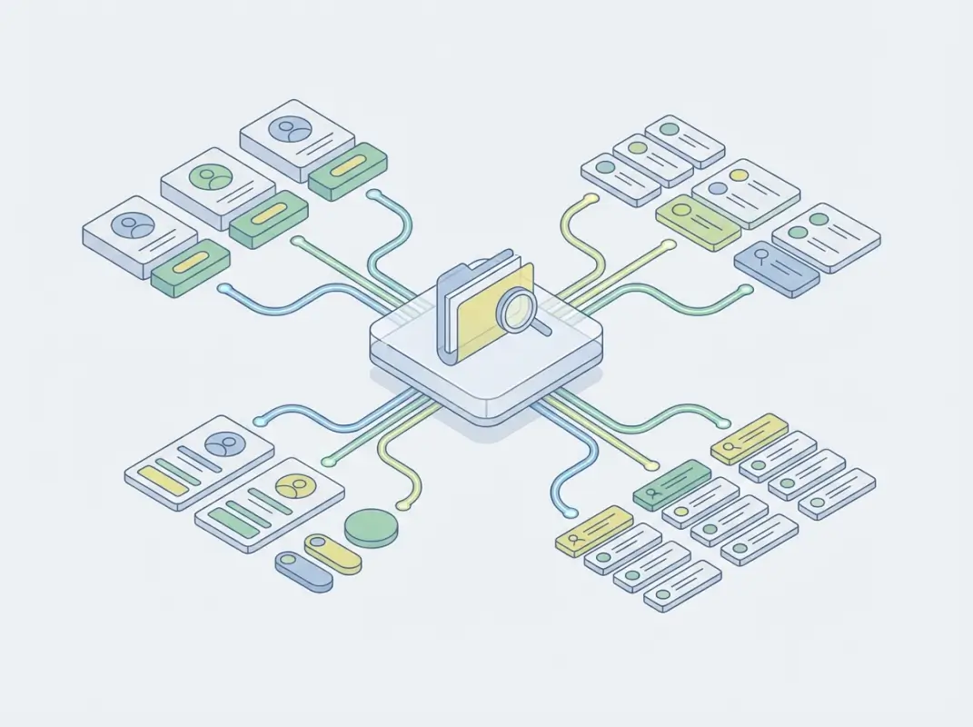
Information architecture and listing taxonomy
Start by auditing existing or competitor directories to identify common patterns and gaps. Map listings to a draft taxonomy on paper or in a spreadsheet, grouping by high-level themes (industry, geography, service type). Validate labels with a small user panel: ask participants to predict where they’d find specific listings; mismatches signal confusing category names.
Use metadata consistently: assign every listing a primary category, optional secondary categories, and attribute tags (e.g., “wheelchair accessible,” “open late”). This structure powers faceted filters and ensures each listing appears in relevant searches. Publish a style guide for contributors so new listings follow the same tagging conventions, maintaining consistency as the directory scales.
Content strategy for listings and metadata
Thumbnails, summaries, and trust signals transform raw listings into scannable cards that support quick comparisons. A listing card should display a high-quality image or logo, a concise one- to two-sentence summary, average rating, review count, and key attributes—location, price tier, availability. This snapshot lets users triage dozens of results at a glance, clicking through only for listings that match their criteria.
Define field constraints to enforce quality: require character limits on titles (50–70 characters) and summaries (120–160 characters), minimum image dimensions, and structured data for hours, contact details, and pricing. Structured data also improves SEO; search engines can display rich snippets with ratings and prices in organic results. Automate validation where possible—reject submissions missing required fields or images below resolution thresholds—so every listing meets baseline standards.
Incorporate user-generated signals like reviews, ratings, and “verified” badges to build trust. Display aggregate ratings prominently on cards and sort results by relevance, rating, or recency. Highlight top-rated or featured listings with subtle visual cues—border accents, “Editor’s Choice” ribbons—but avoid overwhelming the layout; users distrust directories that look too commercial. Balance monetization (promoted placements) with organic relevance to maintain credibility.
| Listing Element | Purpose | Best Practice |
|---|---|---|
| Thumbnail / Logo | Visual recognition | Minimum 300×200 px, consistent aspect ratio |
| Title | Primary identifier | 50–70 characters, descriptive not generic |
| Summary | Quick value proposition | 120–160 characters, highlight unique features |
| Rating & Reviews | Trust signal | Display average (0.0–5.0), count (e.g., “142 reviews”) |
| Attributes | Filter & comparison | Icons or tags for key features (location, price tier, hours) |
IV. Performance, Engagement, and Conversion
Performance directly impacts engagement and conversion: directories that load quickly and respond instantly to filters keep users exploring, while sluggish experiences drive bounces. Aim for a Largest Contentful Paint (LCP) under 2.5 seconds and a First Input Delay (FID) below 100 milliseconds on both desktop and mobile. Optimize images with modern formats (WebP, AVIF), lazy-load off-screen content, and minimize JavaScript blocking the main thread.
Perceived performance matters as much as raw speed. Show skeleton screens or placeholder cards while results load; users tolerate brief waits when they see progress. When applying filters, update counts and visible listings immediately—even if full results take another second—to convey responsiveness. Progressive enhancement ensures core search and filter functionality works without JavaScript, then layers on smooth transitions and animations for modern browsers.
Speed, responsiveness, and perceived performance
Implement server-side rendering or static site generation for initial page loads so search engines and users see content instantly. For client-side filtering, cache frequently accessed datasets in memory or sessionStorage to avoid redundant API calls. Debounce search inputs and filter toggles by 300–500 milliseconds to reduce server load and avoid flickering UI as users type or click rapidly.
Use Content Delivery Networks (CDNs) to serve assets from edge locations close to users; this cuts latency for images, stylesheets, and fonts. Monitor Core Web Vitals in production with tools like Google Search Console or Lighthouse CI integrated into your deployment pipeline. Set budgets for bundle sizes—target under 200 KB for initial JavaScript on mobile—and fail builds that exceed thresholds, forcing teams to optimize before shipping.
Engagement metrics and behavioral signals
Track key funnel metrics: search-to-results time, filter application rate, listing card clicks, detail-page views, and conversions (contact form submissions, bookings, external-link clicks). High filter usage signals users need granular control; low click-through from cards to detail pages may indicate poor thumbnails or summaries. Segment metrics by device and traffic source to identify platform-specific friction.
Instrument behavioral signals like scroll depth, time on page, and heatmaps to understand how users engage with listings. If most users scroll past the first ten results without clicking, your relevance algorithm or default sort may need tuning. A/B test different card layouts, rating displays, and call-to-action placements; measure impact on click-through rate and conversion. Capture every filter combination users try; popular combinations inform which facets deserve prominent placement or pre-set “quick filters” on the homepage.
Monitor qualitative feedback through session replays and user interviews. Watch real users attempt tasks—”Find a pet-friendly hotel in downtown”—to spot confusing labels, hidden filters, or unexpected dead ends. Combine quantitative drop-off points with qualitative “why” insights to prioritize fixes. Iterate continuously: deploy small improvements weekly rather than waiting for major redesigns, using feature flags to roll out changes gradually and revert if metrics regress.
| Metric | What It Measures | Target Benchmark |
|---|---|---|
| Time to First Result | Speed of initial search | < 1 second |
| Filter Application Rate | % of sessions using filters | > 50% |
| Card Click-Through Rate | Listing cards → detail views | > 15% |
| Conversion Rate | Detail views → action (contact, book) | > 5% |
| Bounce Rate | Single-page exits | < 40% |
V. Design Systems, Consistency, and Maintenance for Long-Term Quality
A design system codifies reusable components—listing cards, modals, filter panels, pagination controls—into a shared library with clear usage guidelines. This consistency accelerates development: new features inherit the same look and feel, reducing QA time and cognitive load for users who recognize familiar patterns. Document each component’s anatomy, states (default, hover, active, disabled), accessibility requirements, and code snippets in a central hub (Storybook, Figma, or internal wiki).

Governance ensures the system evolves without fragmenting. Appoint a small design-systems team or designate rotating custodians who review proposed changes, maintain documentation, and deprecate outdated components. When a new use case demands a variant—say, a compact listing card for mobile—decide whether to extend the existing component or create a new one; proliferating one-off variants dilutes consistency. Publish a changelog so all teams know when components update or retire.
Scalable design systems for directories
Start with a core set of atomic components: buttons, input fields, icons, typography styles, and color tokens. Combine atoms into molecules—a filter chip is an icon plus a label and close button—then organisms like a filter sidebar or listing grid. Define spacing, border-radius, and shadow tokens centrally so designers and developers reference the same variables; changing a single token updates every instance, ensuring brand tweaks propagate instantly.
Version your design system and tie releases to your product roadmap. When launching a major directory feature—multi-location search, saved-search alerts—introduce any new components in the design system first, test them in isolation, then integrate into production. Use feature flags to roll out component updates gradually; if a redesigned listing card degrades conversion in A/B tests, roll back to the previous version without touching other components.
Maintenance, testing, and iteration
Schedule quarterly accessibility audits using automated scanners (axe, WAVE) and manual keyboard/screen-reader walkthroughs. Fix contrast failures, missing ARIA labels, and focus-management issues before they accumulate. Run visual regression tests—screenshot comparisons on every pull request—to catch unintended style changes; tools like Percy or Chromatic flag pixel differences that code reviews might miss.
Conduct usability tests with five to eight participants every six to eight weeks, rotating tasks to cover search, filtering, detail views, and mobile flows. Synthesize findings into a prioritized backlog: critical blockers (broken filters, inaccessible forms) ship within a sprint; minor polish (icon tweaks, micro-copy improvements) queue for the next design-system release. Track design-debt tickets separately and allocate 10–20% of sprint capacity to resolving them, preventing long-term decay.
Publish performance budgets and usability benchmarks in your design-system documentation. New components must meet LCP, contrast, and keyboard-navigation standards before merging. Celebrate wins—when conversion improves or support tickets drop—by sharing metrics with the broader team, reinforcing the value of disciplined design-system investment. Over time, this culture of continuous improvement sustains quality even as the directory scales to thousands of listings and dozens of contributors.
| Maintenance Activity | Frequency | Owner / Tool |
|---|---|---|
| Accessibility Audit | Quarterly | Design team + axe/WAVE |
| Visual Regression Testing | Every PR | CI/CD pipeline + Percy/Chromatic |
| Usability Testing | Every 6–8 weeks | UX researcher + 5–8 participants |
| Design-Debt Sprint | 10–20% capacity/sprint | Product + engineering |
| Component Versioning | Tied to product releases | Design-systems custodian |
Frequently Asked Questions
What are the essential UI design principles for a directory website?
Essential UI principles include strong visual hierarchy to guide attention, consistent branding for trust, clear navigation with intuitive filters, accessible color contrast and keyboard support, and fast load times with skeleton screens. Prioritize listing card clarity, search prominence, and responsive layouts across devices.
How can I improve listing discoverability and filter effectiveness on a directory?
Implement faceted search with clear result counts, establish a logical taxonomy with consistent labels, display active filters prominently with easy reset options, use breadcrumb trails for navigation context, and show loading states during filtering. Test filter combinations to ensure relevant results appear quickly.
What accessibility considerations should I prioritize in a directory UI?
Prioritize WCAG-compliant color contrast ratios of at least 4.5:1, full keyboard navigation for filters and listings, semantic HTML with proper heading hierarchy, ARIA labels for interactive components, screen-reader friendly result announcements, and skip-to-content links. Conduct regular accessibility audits with assistive technology.
How do I measure directory engagement and conversion performance?
Track time-to-first-result, filter usage rate, listing detail click-through rate, save or bookmark actions, search refinement frequency, and conversion funnel completion. Monitor bounce rates on search-result pages and correlate listing card design changes with engagement metrics through A/B testing.
What are concrete steps to implement a scalable design system for a directory?
Document reusable components like listing cards, filters, modals, and pagination in a shared library. Define tokens for colors, spacing, and typography. Establish governance for updates, create usage guidelines, build a component playground for testing, and schedule quarterly reviews to ensure consistency as features expand.
How should I organize categories and subcategories in a directory?
Create a shallow, broad taxonomy with no more than three levels deep to prevent user confusion. Use mutually exclusive categories with clear, jargon-free labels, conduct card sorting with target users to validate groupings, and provide cross-category tags for listings that span multiple areas.
Can good visual design reduce bounce rates on directory platforms?
Yes. Clear visual hierarchy, fast load times, and intuitive navigation reduce cognitive load and friction, keeping users engaged longer. Consistent branding builds trust, while accessible design ensures diverse users can complete tasks. Data shows directories with strong design see lower bounce rates and higher conversion.
What listing metadata should I display on directory result cards?
Include a high-quality thumbnail, concise title, one-line description, location or service area, price or pricing tier, rating with review count, and key feature badges. Limit cards to six to eight data points to maintain scannability and avoid overwhelming users during comparison.
Building a Directory That Users Love and Return To
Directory platforms live or die by their ability to connect users with the right results, quickly and intuitively. The five principles outlined above—visual hierarchy and branding, usability and accessibility, information architecture and content, performance and engagement, and scalable design systems—form a holistic framework that addresses every layer of the user experience. When you invest in strong visual design, you make scanning and navigation effortless. When you prioritize accessibility and usability, you open your platform to a wider audience and reduce frustration. When you build robust information architecture and content strategy, you ensure users find exactly what they need without extra clicks. When you optimize performance and track engagement, you turn passive browsers into active converters. And when you establish a design system with ongoing maintenance, you future-proof your directory as it grows.
This framework is not about perfection from day one—it’s about thoughtful iteration. Start by auditing your current directory against these five areas. Identify the biggest friction points in your funnel: Are users abandoning search because filters are unclear? Are listing cards missing trust signals like ratings or verified badges? Is your mobile experience sluggish or hard to navigate? Prioritize the highest-impact fixes first, then roll out improvements in cycles, measuring engagement and conversion at each step. Use A/B testing to validate design changes, conduct accessibility audits quarterly, and gather qualitative feedback through user testing sessions.
Remember that directories are discovery engines. Users arrive with a need, and your job is to make the path from intent to action as smooth and delightful as possible. Every design decision—from the size of your search box to the wording of your filter labels—either accelerates or impedes that journey. By grounding your choices in the principles of hierarchy, usability, information architecture, performance, and systematic consistency, you create a platform users trust, recommend, and return to whenever they need what you offer.
Ready to Transform Your Directory?
Apply these five principles to your platform today. Conduct a focused audit of your visual hierarchy, usability, information architecture, performance metrics, and design-system maturity. Identify one high-impact improvement in each area, set measurable targets, and implement changes iteratively. Track engagement and conversion data to validate your wins, then expand. Your users will notice the difference—and your business metrics will reflect it.
Start small, measure rigorously, and build momentum. The directories that win are the ones that never stop improving.
Was this article helpful?