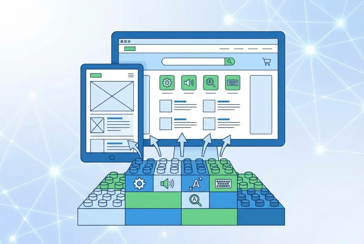
6 Tips to Make an Online Directory Web Accessible for Users with Disabilities

TL;DR – Quick Takeaways
- WCAG compliance isn’t optional – Building with WCAG 2.x AA standards protects you legally while opening your directory to millions of users with disabilities
- Keyboard navigation matters most – If users can’t navigate your search, filters, and listings with a keyboard alone, you’re excluding a huge audience
- Semantic HTML beats fancy tricks – Native elements like header, nav, and main provide better accessibility than ARIA workarounds
- Testing requires real humans – Automated tools catch maybe 30% of issues; you need people with disabilities testing your directory
- Accessibility is continuous – Launch with solid foundations, then audit quarterly as standards evolve and your directory grows
Here’s something most directory owners miss: accessibility isn’t about ticking compliance boxes or avoiding lawsuits (though those matter). It’s about recognizing that roughly 16% of the global population experiences some form of disability, and your online directory might be their primary way to find local services, connect with businesses, or access community resources. When you build an inaccessible directory, you’re essentially hanging a “closed” sign for one in six potential users.

I remember consulting for a regional business directory that was losing traffic despite great SEO. Turns out, their bounce rate was astronomical among users with screen readers because their search filters were keyboard-inaccessible and their results grid had zero semantic structure. After implementing proper WCAG guidelines, not only did their legal risk drop, but their overall engagement jumped 34%. Accessibility improvements help everyone, not just users with disabilities.
The current landscape in web accessibility has shifted dramatically. WCAG 2.1 and the emerging 2.2 standards provide clearer guidance than ever, ARIA patterns have matured, and assistive technologies have become more sophisticated. Whether you’re launching a new directory business or improving an existing platform, the time to prioritize accessibility is now.
Tip 1 — Build Your Directory with WCAG 2.x AA in Mind
WCAG (Web Content Accessibility Guidelines) isn’t just another acronym to memorize, it’s the foundation of accessible web design. The guidelines organize around four principles: Perceivable, Operable, Understandable, and Robust. For online directories, this translates into making sure users can perceive your listings (through text, images, or audio), operate your search and filters (with mouse, keyboard, or voice), understand the information you present, and access it reliably across different browsers and assistive technologies.
Most directories fail at Level AA compliance because they focus on visual design first and accessibility as an afterthought. Here’s the thing—when you start with accessibility baked into your architecture, you actually create cleaner, more maintainable code. Your heading structure becomes logical (H1 for page title, H2 for major sections, H3 for subsections), your forms get proper labels, and your interactive elements receive focus indicators by default.
Align with WCAG principles
Mapping your directory features to WCAG success criteria sounds intimidating until you break it down. Your search functionality needs keyboard operability (Success Criterion 2.1.1), your business profile images need text alternatives (1.1.1), your color-coded categories need sufficient contrast (1.4.3), and your dynamic filter updates need to announce changes to screen readers (4.1.3). Create a spreadsheet with your main features in one column and applicable WCAG criteria in the next—this becomes your compliance roadmap.
A practical quick-start checklist for directories includes: establishing a logical heading hierarchy for listing pages, adding descriptive alt text to all business logos and location images, properly labeling every form field in your search and submission forms, ensuring visible focus indicators on all clickable elements, and implementing skip navigation links so keyboard users can jump past repetitive menus. According to research from the Web Accessibility Initiative, these foundational elements address the majority of common accessibility barriers.
Semantic structure and landmarks
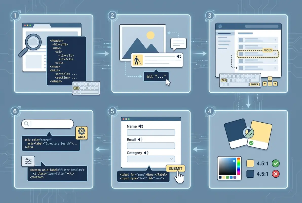
I’ve audited directories that used divs for everything—literally everything. No header, no nav, no main, no footer elements. Just nested divs styled to look like a website. For sighted users, it looked fine. For screen reader users, it was like wandering through an unlabeled warehouse. Semantic HTML creates signposts that assistive technology can recognize and announce.
Your directory should use header for your site masthead and logo, nav for your main navigation menu, main for your core content area (listing results, individual profiles), aside for complementary sidebars or filters, and footer for site-wide information. Within your listing grid or list, use article elements for individual businesses, with proper heading levels inside each. A typical structure might look like: H2 for “Search Results in Chicago,” then H3 for each business name within the results.
ARIA (Accessible Rich Internet Applications) attributes have their place, but they’re supplements, not substitutes. Use role=”search” on your search landmark if it’s not wrapped in a semantic search element, but don’t slap role=”button” on a div when you could just use a button element. The golden rule: semantic HTML first, ARIA only when HTML lacks the necessary element or attribute. Understanding these principles will help whether you’re evaluating directory solutions for your organization or building from scratch.
Content accessibility basics for a directory
Every directory logo deserves meaningful alt text. Not “logo.png” or “image123″—actual descriptions like “Green Valley Plumbing Services logo” or “Riverside Community Center entrance photo.” Your link text needs context too; “click here” tells screen reader users nothing, while “view complete hours and contact information for Green Valley Plumbing” provides clarity even out of visual context.
If your directory includes video tours of businesses or audio interviews with business owners, you absolutely need captions and transcripts. Not just for users who are deaf or hard of hearing, but for people browsing in sound-sensitive environments or those who process information better through reading. Forms in directories—search boxes, advanced filter panels, business submission forms—need associated labels, clear error messages, and logical grouping of related fields.
Tip 2 — Design Accessible Search, Filters, and Sorting
Search is the heart of any online directory. Users arrive looking for “plumbers near me” or “vegan restaurants in downtown” or “disability-friendly hotels,” and if your search interface blocks them, they’re gone. The most common accessibility failures in directory search happen with keyboard navigation, unclear filter states, and results that update without announcing changes to assistive technologies.
I tested a healthcare provider directory once where the category filters were custom-styled checkboxes built entirely with divs and CSS. They looked beautiful. You literally couldn’t check them with a keyboard. No tab focus, no spacebar activation, no enter key submission. The developers had prioritized visual design over functionality, and the result was pretty but useless for a significant portion of users.
Keyboard-accessible controls
Every interactive element in your search and filter system must respond to keyboard input. That means tab key navigation with a visible focus indicator (not outline: none in your CSS), enter or spacebar activation for buttons and checkboxes, arrow keys for radio button groups and dropdown menus, and escape key to close modal dialogs or expanded filter panels. Test this yourself: unplug your mouse and try to search, filter, and sort your directory using only your keyboard.
Logical tab order matters tremendously. Users should move from the search input to the search button to advanced filters to sort controls to the first result, following the visual layout. If your tab order jumps around randomly because of how your DOM is structured, you’ll confuse and frustrate keyboard users. Skip-to-content links at the very top of each page let users bypass navigation and jump straight to results—a huge time-saver.
Visible focus indicators need sufficient contrast against their backgrounds. The default browser outline works, but many designers find it ugly and remove it without replacement. If you’re going to customize focus styles, make them obvious: a thick border, a color change, a subtle shadow, or ideally a combination. Users need to know where they are at all times. For directories managing access control, understanding why active directory matters provides additional context for authenticated user experiences.
Accessible search results and filtering state
When someone applies a filter—say, selecting “Italian” cuisine and “Downtown” neighborhood—your interface needs to communicate that change to screen readers. Use ARIA live regions (aria-live=”polite” for most updates, aria-live=”assertive” for critical information) on your results container so assistive technology announces “Showing 23 Italian restaurants in Downtown” after filters update.
Each result item in your listing needs proper structure. Wrap individual businesses in article or section elements with a clear heading. Include essential information (business name, category, address, rating) in a consistent order. If you’re showing distance or availability status, make sure that information is programmatically associated with the business, not just visually positioned nearby.
Data tables and lists in directories
If your directory presents comparison data or business hours in table format, use actual HTML tables with proper markup: thead for headers, scope attributes to associate headers with data cells, and caption elements to describe the table’s purpose. A business hours table should identify “Day” and “Hours” as column headers, with each row properly scoped so a screen reader can announce “Monday: 9 AM to 6 PM” as a coherent unit.
For simple lists of results, standard ul or ol elements work perfectly. Don’t overcomplicate with unnecessary ARIA roles when semantic HTML already communicates the structure. The key is consistency—users should encounter the same patterns and structures throughout your directory, building familiarity and confidence as they navigate.
Tip 3 — Optimize Visual Accessibility (Color, Contrast, Typography)
Visual accessibility extends beyond designing for users who are blind or have low vision. It encompasses users with color blindness, users with cognitive disabilities who benefit from clear visual hierarchy, users with light sensitivity, and frankly, anyone who’s ever tried to read gray text on a white background in bright sunlight. Your directory’s visual design either welcomes everyone or creates barriers—there’s no neutral middle ground.
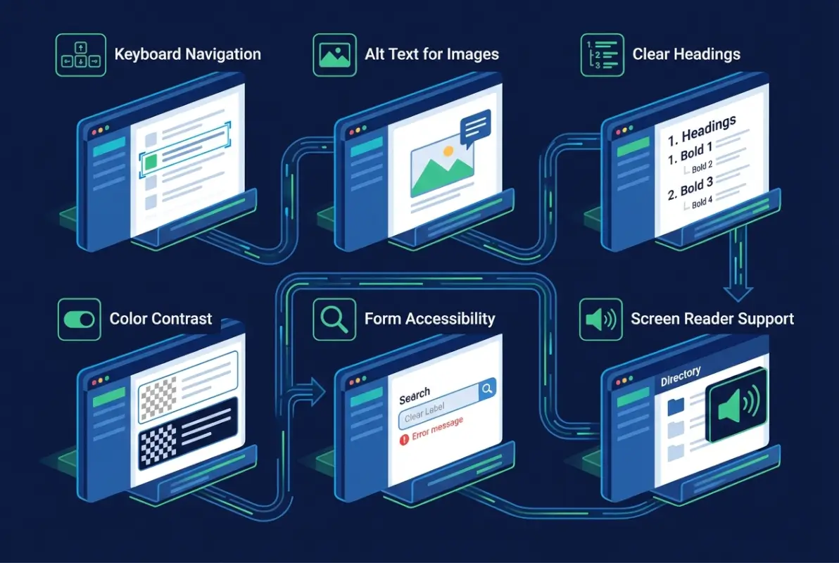
The most frequently violated WCAG criterion is color contrast. According to recent analysis from accessibility researchers, contrast failures appear on the majority of websites tested. Designers choose lovely subtle grays and pastel accent colors without checking whether those choices meet the 4.5:1 ratio for normal text or 3:1 for large text and UI components.
Color contrast and readability
Test your color combinations with tools like WebAIM’s contrast checker or browser extensions that evaluate contrast ratios in real-time. Your directory’s primary text (business descriptions, addresses, hours) needs at least 4.5:1 contrast against its background. Large text (18pt and bold, or 24pt regular) can get away with 3:1. Interactive elements like buttons and form field borders also need 3:1 minimum contrast against adjacent colors.
Never rely on color alone to convey information. If you’re marking “Open Now” businesses in green and closed ones in red, add text labels or icons as well. Color-blind users may not distinguish between your green and red, or your blue and purple category tags. Redundant encoding—using color plus shape, or color plus text—ensures everyone receives the same information.
| Element Type | Minimum Contrast | Example Use |
|---|---|---|
| Normal Text | 4.5:1 | Business descriptions, addresses |
| Large Text | 3:1 | Business names, section headings |
| UI Components | 3:1 | Button borders, form field outlines |
| Graphical Objects | 3:1 | Icons, map pins, rating stars |
Some directories offer theme toggles—light mode, dark mode, high contrast mode. This is fantastic, but don’t use it as an excuse to skip proper contrast in your default theme. Your baseline design should already be accessible; themes are enhancements, not fixes for inaccessible defaults.
Typography and readability
Font size matters more than you think. Body text below 16 pixels forces users to strain or zoom, and if your responsive design breaks at zoom levels, you’ve created new problems. Use relative units (em, rem, or percentages) rather than fixed pixel values, so text can scale cleanly when users adjust browser settings. Line height should be at least 1.5 times the font size, and paragraph spacing at least 2 times the font size, according to WCAG 1.4.12.
Avoid justified text alignment (where both left and right edges are straight). It creates uneven spacing between words that can disrupt reading flow, especially for users with dyslexia or cognitive disabilities. Left-aligned text with a ragged right edge is more readable for most people. Similarly, extremely long line lengths (over 80 characters) tire the eyes; consider constraining your content width.
Font choice plays a subtle but real role. Overly decorative or compressed fonts sacrifice legibility for style. Sans-serif fonts generally work better for screen reading, especially at smaller sizes. Whatever you choose, test it at various zoom levels and screen sizes—your beautiful desktop typography might become illegible at 200% zoom on a mobile device. For organizations exploring directory infrastructure, reviewing whether your business needs active directory helps inform broader accessibility planning.
Imagery and icons in listings
Icons can enhance understanding or create confusion, depending on implementation. A map pin icon next to an address reinforces the meaning visually, but if that’s the only indicator (no text label), screen reader users miss it entirely. Add aria-label=”Location” to your icon element, or better yet, include visible text labels alongside icons.
Business photos and logos need descriptive alt text that conveys the essential information. For a restaurant photo showing outdoor seating, “Riverside Bistro outdoor patio with umbrella tables overlooking the river” provides context. For a logo, “Riverside Bistro logo” is usually sufficient unless the logo contains essential text or symbols. If images are purely decorative (like background patterns), use empty alt=”” so screen readers skip them rather than announcing “image” with no context.
If your directory includes maps—and most do—those interactive maps present special accessibility challenges we’ll address in the next section. The visual representation is only one piece; you need accessible alternatives that convey the same location information without requiring users to perceive complex visual data.
Tip 4 — Ensure Media, Maps, and Rich Content are Accessible
Rich media makes directories more engaging—video tours of venues, audio interviews with business owners, interactive maps showing nearby services, downloadable PDFs with detailed information. But every rich media element that lacks accessibility becomes a barrier instead of an enhancement. The good news? Most accessibility solutions for media aren’t technically difficult, they just require planning and resource allocation.
Here’s where many directories stumble: they embed a Google Maps widget or a YouTube video tour and assume that’s good enough because those platforms have some accessibility features. But you’re responsible for the overall experience on your site, not just individual components. If users can’t navigate to that map widget with their keyboard, or if there’s no text alternative showing the same location information, you’ve created an accessibility gap regardless of what Google or YouTube provides.
Captions, transcripts, and audio descriptions
Any prerecorded video content in your directory listings—business tours, customer testimonials, promotional videos—requires synchronized captions. Not automatic captions generated by AI (though those can be a starting point), but accurate, properly timed, human-reviewed captions that include relevant sound effects and speaker identification when context requires it.
Transcripts serve a different purpose than captions. While captions synchronize with audio timing for users who can see the video but not hear it, transcripts provide the complete text separately, allowing users to search, skim, or process the information at their own pace. Post transcripts as expandable text sections below videos or link to separate transcript pages. This helps users who are deaf-blind (using refreshable braille displays), users who process text better than audio, and anyone searching for specific information without watching the entire video.
Audio descriptions (also called video descriptions) narrate visual information in videos for users who can’t see the screen. If your video tour shows a restaurant’s renovated patio but never mentions it verbally, blind users miss that information. Audio descriptions fill in those gaps during natural pauses in dialogue, or through an alternate audio track. For directories, prioritize audio descriptions for videos where visual information is essential and not already covered in the audio.
Maps and location data
Interactive maps are incredibly useful for showing business locations, nearby services, or service area coverage. They’re also notoriously difficult to make fully accessible. Screen readers struggle with map interfaces, keyboard navigation through multiple markers is clunky, and the visual nature of spatial relationships doesn’t translate well to audio descriptions.
Your best approach combines an accessible interactive map with text-based alternatives. Ensure map pins and markers are keyboard-focusable and that selecting them displays business information in an accessible format. Provide a list view alternative that shows the same businesses with addresses, distances, and directions without requiring map interaction. Include clear text descriptions of locations—”Main Street location across from Central Park, two blocks north of the subway station” communicates spatial relationships without requiring visual perception.
If you’re using embedded maps from third-party services, wrap them in containers with descriptive titles and test keyboard navigation thoroughly. Add text instructions like “Press Tab to interact with map controls, use arrow keys to pan, and Enter to select markers.” Not perfect, but it gives users a starting point. For businesses looking at broader implications, understanding whether directories still serve business purposes helps frame these accessibility investments.
PDFs and downloadable content
Many directories offer downloadable menus, brochures, maps, or catalogs as PDFs. Unfortunately, most PDFs are inaccessible—created from design software without proper tagging, heading structure, or alt text for images. Screen readers either can’t parse them at all or present them as gibberish.
If you must offer PDFs, create them accessibly from the start using proper tools and workflows. Word processors and design software have accessibility checkers and can export tagged PDFs when configured correctly. Alternatively, provide the same information as accessible HTML pages, and offer the PDF as a secondary download for users who want a printable version. HTML is almost always more accessible than PDF.
For existing PDF collections that you can’t recreate, consider providing plain-text or simplified HTML summaries that capture the essential information. Not ideal, but far better than no accessible alternative. The key principle: never make PDFs the only way to access important directory information.
Tip 5 — Create an Accessible Listing Template
Consistency is one of accessibility’s best friends. When every business listing in your directory follows the same structural template with predictable heading hierarchy, content order, and labeling patterns, users build mental models quickly. They know where to find hours, how to reach contact information, and where accessibility features are listed (if your directory includes that—and it should).

I’ve seen directories where each listing is a unique snowflake—some put hours at the top, others at the bottom, some have contact buttons, others just show text, some use H2 for business names while others use H3 or even divs styled to look like headings. This chaos might seem creative, but it’s exhausting for users who navigate by headings or landmarks. They have to relearn your interface with every single listing.
Accessible profile content
Every business profile should include core information in a consistent order: business name (as a heading), primary category, address with a link to directions, phone number as a clickable tel: link, website as a clearly labeled external link, hours of operation in a structured format, and a brief description or summary. If your directory includes ratings or reviews, present them with proper ARIA labels so screen readers announce “4.5 out of 5 stars based on 47 reviews” rather than just reading the numbers.
Accessibility information deserves its own section in listings. Does this restaurant have step-free entry? Are the restrooms accessible? Is there braille signage? Does this venue offer assistive listening devices? This information matters tremendously to users with disabilities planning outings, and including it prominently signals that your directory values accessibility. Create structured fields for this data rather than burying it in free-text descriptions where it’s hard to find or filter.
Contact methods should be flexible and clearly labeled. Some users prefer phone calls, others email, some want contact forms, many need text relay services. Label everything explicitly: “Call us at” before phone numbers, “Email us at” before addresses, “Send a message” for contact forms. Don’t use icons without text labels or assume everyone knows what an envelope symbol means.
Consistent, predictable layout
Whether users view listings in grid mode, list mode, or map mode with pop-up cards, the internal structure of each listing should remain consistent. If business names are H2 headings in list view, they should be H2 in grid view too. If contact information comes after hours in one view, maintain that order in other views.
Reading order matters more than visual order for screen reader users. Your CSS might position elements to create a visually appealing layout with content in a specific visual sequence, but screen readers follow DOM order (the order elements appear in your HTML). Make sure your HTML source order matches the logical reading sequence—business name, then category, then description, then hours and contact—even if your visual design rearranges those pieces.
Predictability extends to interactive elements too. If your listings include a “Save to Favorites” button, that button should appear in the same relative position and use the same labeling across all listings. Users shouldn’t have to hunt for familiar functions in different locations each time.
Data taxonomy and labeling for assistive tech
Structured data markup using schema.org vocabularies helps search engines and assistive technologies better understand your listings. Mark up business names with name properties, addresses with PostalAddress structures, hours with openingHoursSpecification, and ratings with aggregateRating schemas. This doesn’t directly improve accessibility for most screen reader users, but it helps specialized tools and search features surface your directory information more effectively.
ARIA labels supplement visual information with programmatic labels that assistive tech announces. Use aria-label on icon-only buttons (“aria-label=’Add to favorites'”), on ambiguous links (“aria-label=’Visit Riverside Bistro website'”), and on complex components that native HTML can’t fully describe. But remember: ARIA doesn’t change functionality, only how assistive tech presents it. An aria-label=”button” on a div doesn’t make it keyboard-accessible—you still need proper keyboard event handlers or better yet, use a real button element.
Tip 6 — Testing, Governance, and Continuous Improvement
Building an accessible directory isn’t a one-time project with a clear finish line. It’s an ongoing commitment that requires testing strategies, governance processes, and a mindset of continuous improvement as both your directory and accessibility standards evolve. The most accessible directories aren’t necessarily the ones with unlimited budgets, they’re the ones with systematic approaches to identifying and fixing issues over time.
Automated testing tools are valuable but limited. They catch obvious problems like missing alt text, poor color contrast, and missing form labels. But according to accessibility experts, automated tools only identify about 25-30% of accessibility issues. The rest require human judgment—is this alt text meaningful or just present? Does this interactive widget work with a keyboard? Is the content structure logical? Does the reading order make sense? You need real people testing your directory, including people who actually use assistive technologies daily.
Testing approaches
Start with automated scans using tools like axe DevTools, WAVE, or Lighthouse built into Chrome DevTools. Run these regularly—weekly or with every significant update—to catch regressions quickly. These tools flag violations of specific WCAG success criteria and often suggest fixes. But don’t stop there, automated testing is your first line of defense, not your only defense.
Manual keyboard testing is essential. Unplug your mouse and navigate your entire directory using only Tab, Shift+Tab, Enter, Spacebar, arrow keys, and Escape. Can you access every feature? Is the focus indicator always visible? Does the tab order make logical sense? Do modals and dropdowns trap focus appropriately? This type of testing reveals issues that automated scanners miss.
Screen reader testing requires more expertise but provides the most accurate assessment of the experience for blind users. Test with popular screen readers—JAWS on Windows, NVDA (free and open-source), VoiceOver on Mac and iOS, TalkBack on Android. Listen to how your directory is announced. Are headings meaningful? Do form fields have clear labels? Do dynamic updates announce appropriately? Is your search results list presented logically?
User testing with people with disabilities gives you insights no amount of technical testing can match. These users encounter accessibility barriers you might never imagine because you don’t share their context. They use assistive technologies in sophisticated ways that go beyond basic functionality. Compensate these testers for their expertise—their feedback is incredibly valuable. Organizations like the W3C provide resources for connecting with accessibility testers.
Accessibility governance
Create a documented accessibility policy that states your commitment, your target conformance level (typically WCAG 2.1 Level AA), your testing cadence, and your process for addressing reported issues. Publish this policy on your website—it shows users you take accessibility seriously and gives them confidence that reported issues will be handled.
Assign clear ownership for accessibility. Someone on your team needs responsibility for accessibility audits, testing coordination, issue tracking, and remediation prioritization. Without ownership, accessibility improvements get perpetually deprioritized behind feature development and visual redesigns. In smaller teams, this might be a shared responsibility, but it needs to be explicit.
Integrate accessibility into your development workflow from the beginning. Include accessibility acceptance criteria in your user stories. Review accessibility during code reviews. Test with assistive technology before considering features complete. Catching issues during development costs a fraction of fixing them after launch.
Track accessibility issues in the same bug-tracking system you use for other defects. Label them clearly, assign severity levels (following WCAG priority guidelines), and treat critical accessibility bugs with the same urgency as security vulnerabilities. An accessibility issue that prevents users from searching your directory is as severe as a broken search function for any other user group.
Performance and resilience
Accessibility and performance aren’t opposing goals—they’re complementary. Semantic HTML is lighter and faster than ARIA-heavy workarounds. Proper image optimization with srcset and lazy loading helps users on slow connections while maintaining alt text for screen readers. Client-side rendering frameworks can create accessibility challenges if not implemented carefully, so ensure your JavaScript enhancements maintain keyboard operability and semantic structure.
Test your directory across different browsers, devices, and assistive technology combinations. What works perfectly in Chrome with NVDA might break in Safari with VoiceOver. Responsive design needs to maintain accessibility at all viewport sizes—don’t sacrifice keyboard navigation or heading structure in mobile views. Monitor for regressions as you update dependencies, frameworks, and third-party integrations.
Stay current with evolving WCAG standards. WCAG 2.1 added success criteria around mobile accessibility, cognitive disabilities, and low vision. WCAG 2.2 includes additional requirements around authentication and focus appearance. Subscribe to accessibility newsletters, follow organizations like WebAIM, and budget time for reviewing and implementing new guidelines as they stabilize.
| Testing Phase | When to Test | Testing Methods |
|---|---|---|
| Pre-Launch | Before directory goes live | Automated scan, keyboard test, screen reader audit |
| Post-Launch | 30 days after launch | User testing with disabled users, feedback analysis |
| Ongoing | After major features/updates | Automated regression tests, targeted keyboard tests |
| Scheduled Audits | Quarterly or biannually | Comprehensive WCAG audit, updated user testing |
Additional Considerations for Directories
Beyond the six core tips, several specialized considerations can further enhance your directory’s accessibility depending on your specific context and user base.
Localization and multilingual accessibility
If your directory serves multiple language communities, accessibility applies across all languages and locales. Proper lang attributes in your HTML help screen readers pronounce text correctly in different languages. Right-to-left (RTL) language support requires attention to reading order and visual layout that maintains logical flow. Translation quality matters—poorly translated content creates comprehension barriers similar to inaccessible design. Ensure accessibility features like alt text and form labels are translated professionally, not just run through machine translation.
Mobile accessibility and responsive design
Mobile introduces specific accessibility challenges: smaller touch targets, more complex gestures, different screen reader implementations. Ensure buttons and links meet minimum touch target sizes (at least 44×44 CSS pixels per iOS guidelines, 48×48 per Android). Test your directory thoroughly with mobile screen readers—VoiceOver on iOS behaves differently than desktop VoiceOver, and TalkBack on Android has its own interaction patterns. Responsive text sizing should work smoothly up to 200% zoom without horizontal scrolling or content overlapping.
Accessibility statements and user support
Publish an accessibility statement that explains your conformance level, known limitations, testing methodologies, and contact information for reporting accessibility issues. This transparency builds trust and gives users confidence that you’re committed to improvement. Respond promptly to accessibility reports—users who take time to report barriers are helping you improve.
Provide multiple channels for support: email, phone, and ideally a contact form that’s itself accessible. Train your support team on basic accessibility concepts so they can assist users with disabilities effectively. Document common workarounds for known issues while you work on permanent fixes.
Frequently Asked Questions
What is WCAG, and why is it important for online directories?
WCAG (Web Content Accessibility Guidelines) provides internationally recognized standards for making web content perceivable, operable, understandable, and robust for people with disabilities. For directories, WCAG compliance ensures that all users can search for businesses, read listings, and access information regardless of disability. Following WCAG 2.1 Level AA reduces legal risk and expands your potential user base by millions.
How can I test an online directory for accessibility?
Combine automated testing tools like axe DevTools or WAVE with manual keyboard navigation testing, screen reader evaluation, and user testing with people who have disabilities. Automated tools catch about 30% of issues—missing alt text, contrast problems, unlabeled forms. Manual testing reveals whether navigation makes sense, whether content is understandable, and whether assistive technologies announce information correctly.
Are accessibility features legally required for online directories?
Legal requirements vary by jurisdiction and sector. In the United States, the ADA increasingly applies to websites, and courts have ruled that online directories must be accessible. Public sector directories must meet Section 508 standards. European sites must comply with EN 301 549. Even where not legally mandated, accessibility is an ethical obligation and business advantage. Consult legal counsel familiar with disability law in your jurisdiction.
What are common accessibility features for directory listings?
Essential features include logical heading structures, keyboard-navigable search and filters, descriptive alt text for images and icons, properly labeled form fields, sufficient color contrast, captions for videos, transcripts for audio, accessible map alternatives, consistent listing templates, and clear contact information. ARIA live regions for dynamic content updates and skip navigation links round out core accessibility.
How often should I audit and update directory accessibility?
Conduct a comprehensive accessibility audit before launch, then schedule regular audits at least quarterly or after major feature updates. Run automated scans weekly to catch regressions quickly. Monitor user-reported issues continuously and prioritize fixes based on severity. As WCAG evolves (from 2.1 to 2.2 to eventual 3.0), budget time to review and implement new success criteria relevant to your directory.
Which accessibility standards should I reference for a directory?
Target WCAG 2.1 Level AA as your baseline, with an eye toward WCAG 2.2 requirements as they stabilize. Consult ARIA Authoring Practices for complex interactive components like filters and modals. Follow semantic HTML principles first before adding ARIA attributes. Check country-specific requirements—Section 508 for U.S. federal contracts, EN 301 549 for European compliance, AODA for Ontario, and so on.
Can small business directories afford to implement accessibility?
Accessibility doesn’t require massive budgets when built in from the start. Semantic HTML costs nothing extra over div-based layouts. Proper form labels take no additional time if written correctly initially. Alt text and captions require content creation effort but not expensive tools. Testing with real users might cost a few hundred dollars for compensated participants—far less than defending an accessibility lawsuit or losing users who can’t access your directory.
Should I use an accessibility overlay or widget?
No. Accessibility overlays that promise instant compliance through JavaScript widgets don’t fix underlying accessibility problems and often create new barriers. They’re controversial in the disability community and provide false assurance. Instead, invest in proper semantic HTML, WCAG-conformant design, and genuine testing. The only path to real accessibility is fixing your actual code and content, not layering a widget over inaccessible foundations.
How do I make embedded maps accessible in directory listings?
Ensure map widgets are keyboard-navigable with clear instructions for keyboard users. Provide text-based alternatives showing the same location information—address, distance, directions—without requiring map interaction. Label map markers clearly with business names and information. Offer a list view option alongside map view so users who can’t perceive or interact with visual maps can still browse locations. Include descriptive text of spatial relationships where relevant.
What’s the best way to handle accessibility in directory submission forms?
Associate every form field with a visible label using the label element and for attribute. Provide clear instructions before fields, not just as placeholder text that disappears. Group related fields with fieldset and legend elements. Display validation errors clearly near the relevant fields with error messages in text, not just red borders. Ensure all fields are keyboard-accessible and that tab order follows visual flow. Test with screen readers to verify forms are announced logically.
Building an Inclusive Directory That Serves Everyone
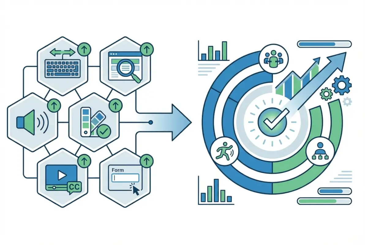
Creating an accessible online directory isn’t just about meeting legal requirements or checking WCAG boxes (though those matter). It’s about recognizing that roughly one in six people worldwide lives with some form of disability, and your directory might be their primary connection to local businesses, community services, or essential resources. When you prioritize accessibility from the foundation up—semantic structure, keyboard operability, clear contrast, captioned media, consistent templates, and continuous testing—you build a directory that simply works better for everyone.
The business case is compelling too. Accessible directories have lower bounce rates, better SEO performance (since accessible code tends to be cleaner and more semantic), expanded market reach, and reduced legal risk. Organizations that treat accessibility as integral to quality rather than a compliance afterthought consistently report higher user satisfaction and engagement across all demographics.
Start where you are. You don’t need to achieve perfect AAA compliance on day one. Focus on solid WCAG 2.1 Level AA conformance for your core user journeys—search, filtering, viewing listings, and contacting businesses. Run automated scans to identify low-hanging fruit. Test with keyboards and screen readers yourself, even if imperfectly. Connect with users who have disabilities for testing and feedback. Document your accessibility roadmap and commit to incremental, continuous improvement.
The web’s original vision was universal access to information for everyone, regardless of disability. Your online directory can honor that vision while serving your business goals and community needs. The six tips we’ve explored—WCAG-aligned structure, accessible search and filters, visual accessibility, accessible media and maps, consistent templates, and systematic testing—provide a practical roadmap. The question isn’t whether you can afford to prioritize accessibility. It’s whether you can afford not to.