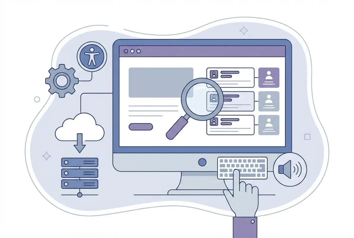
6 Tips to Make an Online Directory Web Accessible for Users with Disabilities

Generating summary...
Building an online directory that everyone can use isn’t just about ticking compliance boxes—it’s about opening your platform to millions of potential users who navigate the web differently. When you design with accessibility in mind from the start, you’re not just avoiding lawsuits (though that’s a nice bonus); you’re creating a better experience for everyone, improving your search rankings, and demonstrating that your platform values real inclusivity.
Here’s something most directory owners miss: accessibility isn’t a feature you bolt on at the end. It’s a fundamental architecture decision that affects everything from your database structure to your JavaScript frameworks. I’ve seen too many well-intentioned teams spend months retrofitting accessibility into platforms that were built without it, when a few smart choices at the beginning would have saved them countless hours and dollars.
TL;DR – Quick Takeaways
- Web accessibility expands your audience – 15% of the global population has some form of disability, representing a massive underserved market
- WCAG 2.2 is your roadmap – Focus on four principles: Perceivable, Operable, Understandable, and Robust content
- Directories have unique challenges – Maps, filters, search results, and dynamic content require special accessibility considerations
- Semantic HTML is your foundation – Proper heading hierarchy, landmarks, and native elements beat fancy JavaScript widgets every time
- Testing requires both automation and humans – Automated tools catch about 30% of issues; real user testing finds the rest
- Implementation takes 7-12 weeks – A structured roadmap with measurable milestones makes accessibility achievable, not overwhelming
Assessing Accessibility Needs for Directory Platforms
Before you dive into technical implementations, you need to understand who you’re building for and what they actually need to accomplish on your directory. This isn’t theoretical—real people with real disabilities will use your platform, and they come with diverse needs that go way beyond just screen reader support.
Understand Your User Base and Disability Scenarios
Your directory serves users with visual impairments who might use screen readers like JAWS or NVDA, but that’s just the beginning. Motor disabilities affect how people interact with your interface—some users navigate entirely by keyboard, others use voice commands, and many rely on switch controls or eye-tracking technology. Cognitive and learning disabilities mean your directory needs clear language, predictable navigation, and content that doesn’t overwhelm. Auditory disabilities matter if you include video content or audio announcements. And neurodivergent users benefit from reduced motion, clear focus indicators, and interfaces that don’t demand split-second timing.
Each group faces specific barriers on directory platforms. Someone using a screen reader needs to understand your search results without seeing visual layouts. A keyboard-only user needs to access every filter and map control without touching a mouse. Someone with cognitive disabilities needs your category structure to make immediate sense, without requiring them to hold complex hierarchies in memory.
Map Essential Directory Tasks to Accessibility Outcomes
Every core function of your directory creates accessibility challenges. When users search your directory, can they reach the search field with keyboard navigation? Do error messages explain what went wrong in plain language? When results appear, does your screen reader announce how many listings were found? Filtering by category, location, or attributes requires accessible dropdown menus, checkboxes that announce their state, and clear feedback about which filters are active.
Map views present particular challenges. Can keyboard users zoom in and out? Do map markers have text alternatives? Is there a list view alternative for users who can’t perceive spatial relationships? When users add or edit listings, are your forms properly labeled? Do required fields announce themselves? Can users who make mistakes understand what needs correction?
For directories with paid listings or checkout processes, the stakes get higher. Financial transactions require extra clarity, and frustrated users encountering accessibility barriers during payment simply abandon the process. That’s not just poor user experience, that’s lost revenue because your interface excluded paying customers.
Legal and Standards Context
Web Content Accessibility Guidelines (WCAG) 2.2 isn’t just best practice anymore—it’s increasingly the legal baseline. The guidelines define three conformance levels: A (minimum), AA (mid-range, typically the target), and AAA (highest). Most organizations aim for WCAG 2.2 Level AA compliance because it balances practical implementation with meaningful accessibility.
In the European Union, EN 301 549 mandates accessibility for public sector websites and many commercial services. The United States has Section 508 for federal systems and increasingly applies ADA Title III to commercial websites. Canada has AODA requirements. Australia has the DDA. The global trend is clear: accessibility is moving from voluntary to mandatory, and the legal risk of ignoring it keeps growing.
But here’s what matters more than legal compliance, when you build an accessible directory, you start building a platform that works better for everyone. Curb cuts were designed for wheelchairs but help parents with strollers, travelers with luggage, and delivery workers with dollies. Your accessibility improvements will benefit all users, not just those with disabilities.
WCAG 2.2 and Beyond: Concrete Targets for a Directory
WCAG 2.2 organizes its success criteria around four principles that form the acronym POUR: Perceivable, Operable, Understandable, and Robust. These aren’t abstract concepts—they translate directly into specific requirements for every element of your directory platform.
Perceivable: Making Content Available to All Senses
Information on your directory must be presentable in ways users can perceive, regardless of their sensory abilities. Every image needs a meaningful text alternative that conveys the same information—for a restaurant listing photo, “Italian restaurant interior with exposed brick walls and candlelit tables” tells users what they need to know, while “IMG_2847.jpg” tells them nothing. Your color contrast ratios need to meet minimum standards: 4.5:1 for normal text, 3:1 for large text and UI components. Low-contrast text might look sleek, but it’s functionally invisible to millions of users.
Your directory’s UI must scale properly when users zoom text to 200% or adjust their browser’s default font size. Content that depends on specific font sizes breaks this requirement. Responsive design helps, but you need to test actual text scaling, not just viewport resizing. And when you present information through color alone—like showing available listings in green and closed ones in red—you exclude colorblind users. Add text labels, icons, or patterns alongside color coding.
Operable: Ensuring Everyone Can Use Your Interface
Every function in your directory must be keyboard accessible. Mouse-only interactions exclude users with motor disabilities, screen reader users, and anyone who prefers or requires keyboard navigation. This means visible focus indicators that clearly show which element currently has keyboard focus, logical tab order that matches the visual layout, and no keyboard traps that prevent users from navigating away from an element.
Your directory shouldn’t impose time limits that users can’t extend, pause, or disable. If you auto-rotate featured listings or implement session timeouts, users need control. And your interface should avoid content that flashes more than three times per second—such content can trigger seizures in susceptible users.
For directories, this gets interesting with interactive maps. Can keyboard users pan and zoom? Do custom controls respond to appropriate keyboard commands? When you implement custom widgets like date pickers or autocomplete search, are they keyboard accessible? Too many developers build beautiful custom components that completely fail keyboard users.
Understandable: Creating Predictable Experiences
Users must be able to understand both the information and the operation of your interface. Use plain language—your directory’s terminology should match what users expect, not internal jargon. If your audience includes non-technical users, avoid assuming everyone knows what “geolocation” or “taxonomies” mean. Identify the language of your content in your HTML so screen readers can use appropriate pronunciation rules.
Navigation should be consistent across your directory. If your main menu appears in the header on your homepage, it should appear in the same location on listing pages, search results, and category pages. Users develop mental models of where things are, breaking consistency breaks those models and creates confusion.
Form inputs need clear labels that remain visible when the field has focus. Placeholder text alone doesn’t meet this requirement because it disappears. Error messages must explain what went wrong and how to fix it—”Invalid input” frustrates everyone, while “Email address must include an @ symbol” actually helps users succeed. When users add listings to your directory, clear guidance prevents frustration and incomplete submissions.
Robust: Building for Compatibility
Your directory’s code must be robust enough to work reliably with current and future assistive technologies. This starts with valid HTML—syntax errors can confuse screen readers and other tools. Use semantic elements appropriately: <nav> for navigation regions, <main> for primary content, <article> for individual listings.
When semantic HTML doesn’t provide what you need, ARIA (Accessible Rich Internet Applications) attributes fill gaps—but use them carefully. The first rule of ARIA is: don’t use ARIA if native HTML works. A <button> element is better than a <div role="button">, because the native element comes with built-in keyboard support and semantics. When you do use ARIA, ensure you implement the complete pattern: roles, states, and keyboard interactions.
Practical Touchpoints for Directories
Search fields need <label> elements or aria-label attributes that clearly identify their purpose. When results load dynamically, use ARIA live regions to announce how many results were found. Filters should announce their state—”Category: Restaurants, checked” versus “Category: Restaurants, not checked”—so screen reader users know which filters they’ve selected.
Map controls present unique challenges. Provide text alternatives for spatial information. Ensure map markers are keyboard focusable and announce relevant information. Consider offering a list view alternative that presents the same information in a format that doesn’t require perceiving spatial relationships. Not everyone processes spatial data effectively, regardless of whether they have a disability.
Architecture Decisions that Impact Accessibility
The technical choices you make when building your directory have cascading effects on accessibility. Some architectural decisions make accessibility straightforward, while others turn it into a constant uphill battle. Getting these foundational elements right saves enormous effort later.
Semantic HTML First
Start with semantic HTML before reaching for JavaScript frameworks or CSS tricks. Use actual <ul> or <ol> elements for your lists of directory results—screen readers announce lists and provide navigation commands for them. When presenting tabular data like business hours or pricing comparisons, use proper <table> markup with <th> headers and scope attributes.
Heading hierarchy matters tremendously. Your page should have one <h1> (typically the page title), with <h2> for major sections, <h3> for subsections, and so on. Don’t skip levels—jumping from <h2> to <h5> confuses screen reader users who navigate by headings. Many screen reader users scan pages by jumping from heading to heading, building a mental outline of the content structure.
Landmark regions help users navigate your directory. The <header>, <nav>, <main>, <aside>, and <footer> elements create programmatically identifiable regions. Screen readers provide commands to jump directly to these landmarks, so users can skip repetitive navigation and jump straight to content.
Accessible Components: Custom Controls Done Right
When you build custom components—autocomplete search, custom select menus, toggle switches—you take on the responsibility of making them accessible. Native HTML controls come with accessibility built in, but custom widgets require careful implementation of ARIA patterns.
A custom autocomplete search needs several elements: the input field must have role="combobox", the suggestion list needs role="listbox", individual suggestions use role="option", and ARIA attributes track which suggestion is selected and whether the list is expanded. Keyboard support requires handling arrow keys for navigating suggestions, Enter to select, and Escape to close the list. That’s significantly more complex than a standard input field.
| Component Type | Native HTML Option | Custom Implementation Requirements |
|---|---|---|
| Dropdown Menu | <select> | ARIA roles, keyboard nav, focus management, state announcements |
| Toggle Switch | <input type=”checkbox”> | aria-checked, role=”switch”, keyboard support, visual indicators |
| Date Picker | <input type=”date”> | Complex grid pattern, keyboard nav, announcements, date format handling |
| Modal Dialog | <dialog> | Focus trap, focus restoration, Escape key, proper labeling |
Before building a custom component, honestly assess whether native HTML meets your needs. If it does, you’ve saved development time and gained better accessibility. If you genuinely need custom functionality, study the WAI-ARIA Authoring Practices Guide—it documents design patterns for common widgets with detailed implementation guidance.
Keyboard-First Design and Focus Management
Design your directory with keyboard navigation as a primary interaction method, not an afterthought. Every interactive element—links, buttons, form controls, custom widgets—must be keyboard accessible. Test your directory by unplugging your mouse and trying to accomplish core tasks. If you get stuck, keyboard users will too.
Focus indicators must be clearly visible. Browser default focus outlines aren’t always sufficient (though they’re better than nothing), so consider enhancing them with CSS. A focus indicator with adequate color contrast and clear borders helps everyone see where keyboard focus currently sits. Many directory platforms struggle with focus management when dynamically loading content or switching between views.
Modal dialogs require focus traps—when a modal opens, keyboard focus should move into it and stay there until the modal closes. Tabbing through should cycle within the modal, not leak out to page content behind it. When the modal closes, focus returns to the element that opened it. Without proper focus management, keyboard users get disoriented and lost in your interface.
ARIA Usage Best Practices and Pitfalls
ARIA is powerful but dangerous in inexperienced hands. The wrong ARIA is worse than no ARIA because it actively misleads assistive technology users. Follow these principles: use native HTML when possible, understand the complete pattern before implementing part of it, test with actual screen readers, and remember that ARIA only changes semantics—it doesn’t change behavior.
Adding role="button" to a <div> tells screen readers it’s a button, but doesn’t make it clickable with Enter or Space—you still need JavaScript for that. Similarly, aria-hidden="true" hides content from screen readers but doesn’t hide it visually, and if you hide focusable content with aria-hidden, keyboard users can focus invisible elements.
Common ARIA mistakes in directories include: forgetting to announce dynamic content updates, using ARIA labels that don’t match visible text, applying roles that contradict native element semantics, and neglecting to update ARIA states when UI changes. If you use aria-expanded="false" on a collapsed filter section, you must update it to aria-expanded="true" when the section expands.
Data Accessibility: How Listings and Maps Should Work
The core content of your directory—the listings themselves—requires particular attention to accessibility. This is where users spend most of their time, and accessibility problems here directly block people from finding and connecting with businesses, services, or resources they need.
Accessible Listing Content
Every listing needs a clear, descriptive title in a proper heading element. For a business directory, “Joe’s Pizza – Downtown Location” works better than just “Joe’s Pizza” when you have multiple locations. The heading level should reflect the information hierarchy—if listings appear in search results, <h3> might be appropriate under an <h2> for “Search Results.”
Listing summaries should provide key information concisely. Users scanning with screen readers benefit from front-loaded content—put the most important details first. “Italian restaurant in downtown Chicago, specializing in wood-fired pizza and pasta” immediately tells users what they need to know, while burying that information after paragraphs of history frustrates quick scanning.
Images in listings must have meaningful alternative text. For a restaurant, describe the atmosphere and food: “Wood-fired margherita pizza on a wooden board with basil garnish.” For a service provider’s headshot: “Maria Rodriguez, CPA, professional headshot.” Generic text like “image” or “photo” provides no value. Missing alt text forces screen reader users to skip images entirely, losing information that sighted users receive.
Structured data helps both search engines and assistive technologies understand your listings. Schema.org vocabulary for local businesses, events, or whatever your directory contains allows you to mark up addresses, phone numbers, hours, and other attributes in machine-readable formats. This improves search engine visibility while potentially enabling assistive technologies to present information in more useful formats.
Map and Spatial Data Accessibility
Interactive maps are everywhere in directory platforms, and they’re notoriously difficult to make accessible. The fundamental problem is that maps convey information spatially—the relative positions of markers, distances between locations, clusters of results in particular areas. This information isn’t inherently accessible to screen reader users or people who don’t process spatial data effectively.
The most important accessibility feature for maps is an alternative list view. Present the same location information in a text-based list that screen reader users can navigate efficiently. Include distances from a reference point if relevant. Allow sorting and filtering that works in both map and list views. Many users will prefer the list view regardless of disability status—it’s often more efficient for certain tasks.
For the map itself, ensure all controls are keyboard accessible. Zoom in/out buttons need keyboard access and clear focus indicators. Pan controls (if present) require keyboard alternatives. Map markers should be keyboard focusable, with Enter or Space opening details. Provide a legend if your map uses different marker types, colors, or icons—and ensure the legend itself is accessible, not just an image.
Consider adding a text search for locations that updates both map and list views. “Show results within 10 miles of 60601” achieves spatial filtering without requiring interaction with a visual map. Proximity-based features shouldn’t depend exclusively on dragging a map or drawing a radius visually.
Dynamic Content and Live Updates
Single-page applications and AJAX-powered directories create particular accessibility challenges. When content updates without a full page reload, screen reader users don’t automatically know anything changed. Without proper announcements, a user might submit a search and have no idea that results just loaded.
ARIA live regions solve this problem. Wrap your results container in a <div role="region" aria-live="polite" aria-atomic="true"> and screen readers will announce content changes. The aria-live="polite" setting waits for a pause in speech before announcing, while aria-live="assertive" interrupts immediately (reserve for urgent updates). The aria-atomic="true" attribute determines whether the entire region content is announced or just changes.
Status messages need explicit announcement. When filters apply, announce “Showing 47 results for restaurants in Chicago.” When a user adds a listing to favorites, confirm “Listing added to favorites.” These messages can be visually brief toast notifications, but they must also be programmatically announced to screen reader users.
Loading states matter too. When content is loading, indicate that to all users. A visual spinner helps sighted users, but add aria-busy="true" to the loading region and provide text like “Loading results…” for screen readers. Remove the busy state when loading completes.
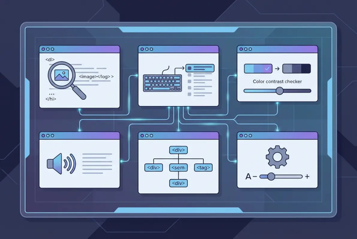
Testing, Validation, and Continuous Improvement
Accessibility isn’t a one-time implementation—it’s an ongoing commitment requiring regular testing, user feedback, and iterative improvements. Your testing strategy should combine automated tools, manual evaluation, and real-user testing to catch different categories of issues.

Automated vs. Manual Testing Balance
Automated accessibility testing tools catch common technical violations quickly—missing alt text, insufficient color contrast, missing form labels, improper heading hierarchy. Tools like axe DevTools, WAVE, or Lighthouse can scan your directory and flag hundreds of issues in seconds. This makes them invaluable for catching regressions and establishing a baseline.
But automated tools typically catch only about 30% of accessibility issues. They can’t evaluate whether your alt text is meaningful, whether your navigation makes logical sense, whether your form flow is intuitive, or whether your custom components actually work with keyboard and screen readers. Manual testing by accessibility experts fills this gap.
Manual testing involves systematically evaluating your directory against WCAG success criteria, testing with various assistive technologies, and applying expert judgment about user experience. An accessibility auditor will navigate your directory with a screen reader, attempt all tasks with keyboard only, test with browser zoom at 200%, and evaluate cognitive load and language clarity. This human evaluation catches nuanced issues that automated tools miss.
Real-User Testing with People with Disabilities
The gold standard for accessibility testing is watching actual users with disabilities attempt tasks on your directory. People who rely on screen readers daily have developed efficient navigation strategies that might differ from what you assume. Keyboard-only users reveal friction points that testing yourself missed. Users with cognitive disabilities identify confusing workflows that seemed obvious to your team.
Recruit testers who represent your actual user base. If your directory serves a specific geographic region or industry, find testers familiar with that context. Pay them fairly—people with disabilities shouldn’t be expected to provide free labor improving your platform. Structure sessions around realistic tasks: “Find a pizza restaurant within 5 miles that’s open now” or “Add your business to the directory and upload a logo.”
Document not just what users struggle with, but why they struggle. The root cause of a problem might differ from the surface symptom. If a screen reader user can’t complete checkout, is it because the form lacks labels, because error messages don’t explain what’s wrong, because required fields aren’t clearly indicated, or because the focus order is illogical? Understanding the why guides effective fixes.
Establish regular feedback channels. Add an accessibility feedback form to your directory that lets users report barriers they encounter. Monitor support requests for accessibility-related complaints. When users tell you something doesn’t work, believe them—they’re the experts on their own assistive technology and needs.
Accessibility Monitoring Cadence and Reporting
Build accessibility testing into your development workflow. Run automated scans as part of continuous integration—fail builds that introduce new violations. Conduct manual audits quarterly for established features and before launching new functionality. Schedule user testing with people with disabilities at least twice annually, more often if you’re making significant changes.
Track measurable goals. How many WCAG violations exist on your core pages? What percentage of form inputs lack proper labels? How many non-text elements are missing alternatives? Set targets for reducing these over time—”Reduce average WCAG violations per page from 23 to under 10 by year end” gives your team a concrete goal.
Report accessibility metrics to stakeholders. When leadership sees data showing accessibility improvements increasing mobile traffic, reducing support costs, or expanding market reach, they’re more likely to prioritize continued investment. Frame accessibility as a business advantage, not just a compliance requirement. Organizations that build accessible directories often see improved user engagement metrics across all user segments.
| Testing Method | Frequency | What It Catches |
|---|---|---|
| Automated Scans | Every build/deploy | Technical violations, missing attributes, color contrast |
| Manual Expert Audit | Quarterly | Complex interactions, logical flow, ARIA implementation |
| User Testing | 2-4 times/year | Real-world usability issues, workflow problems |
| Continuous Monitoring | Ongoing | User-reported issues, regression detection |
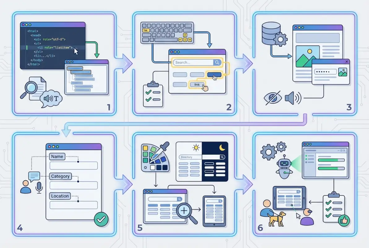
Implementation Roadmap for a Directory
Breaking accessibility work into phases with clear milestones makes the project manageable instead of overwhelming. This 12-week roadmap balances quick wins with foundational improvements, building momentum as your team develops accessibility expertise.
Weeks 1-2: Audit Current Site
Start with a comprehensive baseline assessment. Run automated scans on your most important pages: homepage, search interface, listing detail pages, category pages, map views, forms for adding listings, and checkout if applicable. Document all violations but prioritize high-traffic pages and critical user flows.
Conduct manual keyboard testing—unplug your mouse and attempt core tasks. Can you search? Filter results? View a listing? Navigate the map? Submit a form? Identify where keyboard access breaks down. Test with a screen reader if team members have the skills, or bring in an expert for a few hours of evaluation.
Create a prioritized backlog. Group issues by severity (blocks core tasks vs. minor annoyance), scope (quick fix vs. major refactor), and WCAG level (A, AA, AAA). You want quick wins to build momentum—fixing missing alt text or form labels demonstrates immediate progress—while planning for larger architectural improvements.
Weeks 3-6: Implement Core Improvements
Fix semantic markup issues. Ensure proper heading hierarchy throughout your directory. Add landmark regions (<header>, <nav>, <main>, <footer>) if they’re missing. Use semantic list markup for result sets. These changes improve navigation efficiency for assistive technology users without changing visual design.
Address keyboard accessibility systematically. Ensure all interactive elements receive focus in logical order. Add visible focus indicators where default outlines are inadequate. Fix any keyboard traps. Implement skip links so users can bypass repetitive navigation. These fixes often require CSS adjustments and minor HTML changes rather than major functionality rewrites.
Tackle color contrast failures. Use tools like the WebAIM Contrast Checker to evaluate and fix text/background combinations that don’t meet WCAG requirements. This sometimes requires tough conversations with designers, but it’s non-negotiable for accessibility. Consider establishing a limited palette of pre-approved color combinations that meet contrast requirements.
Write meaningful alt text for all images. Create guidelines for content editors about effective descriptions. Images that are purely decorative can have empty alt attributes (alt="") to hide them from screen readers, but informative images need descriptions that convey the same information the image provides visually.
Weeks 7-9: Improve Dynamic Components
Now tackle your interactive features. Ensure your search interface properly announces results when they load. Add ARIA live regions where content updates dynamically. If you have autocomplete search, implement the complete keyboard pattern with proper ARIA roles and states.
Make filters keyboard accessible and ensure they announce their current state. When a user checks “Open Now,” screen readers should announce that change. When filter results load, announce how many results match. Group related filters in <fieldset> elements with <legend> labels for clarity.
Improve map accessibility. Ensure zoom controls work with keyboard. Make markers keyboard focusable. Add a list view alternative if you don’t have one. Provide text-based ways to filter by location that don’t require interacting with the visual map. This phase might require significant JavaScript work depending on your current map implementation.
Weeks 10-12: User Testing and Finalization
Recruit users with disabilities to test your improved directory. Observe them completing realistic tasks. Document where they still encounter barriers. These insights guide your final round of improvements and help prioritize future work.
Fix the most critical issues identified in user testing. You won’t solve everything in 12 weeks, but you should eliminate barriers that prevent users from completing core tasks. Document remaining issues for future sprints.
Create an accessibility statement for your directory. Explain your commitment to accessibility, what standards you aim to meet, document known issues you’re working to address, and provide a way for users to report accessibility barriers. This transparency demonstrates good faith effort and gives users a feedback channel.
Establish governance for ongoing accessibility. Who reviews new features for accessibility? How are content contributors trained? What’s your testing cadence? When businesses add their own listings, how do you ensure they create accessible content? Accessibility requires sustained attention, not just a one-time project.
Content Strategy and Documentation
The content in your directory—listing descriptions, category explanations, help documentation—contributes significantly to overall accessibility. Clear, well-structured content helps everyone, but it’s particularly important for users with cognitive disabilities and those using assistive technologies.
Accessible Content Guidelines
Plain language makes your directory more accessible. Use common words instead of jargon—”business hours” instead of “temporal availability windows.” Keep sentences reasonably short and focused on one idea. Break complex information into bulleted lists rather than dense paragraphs. This isn’t dumbing down content, it’s respecting your users’ time and cognitive load.
Consistent terminology prevents confusion. If you call them “listings” in one place and “entries” elsewhere, users wonder if those refer to different things. Choose terms and stick with them throughout the interface and documentation.
Reading level matters. Aim for an eighth-grade reading level for general audience content—this isn’t because your users aren’t smart, it’s because people with cognitive disabilities, non-native language speakers, and users under stress all benefit from straightforward language. Tools like Hemingway Editor can assess reading level and suggest simplifications.
Font sizing and spacing improve readability. Use relative units (rem or em) rather than pixels so text scales when users adjust browser settings. Line height of at least 1.5 times font size improves readability. Line length between 50-75 characters per line reduces eye strain—ultra-wide paragraphs are harder to read.
User-Generated Content Considerations
When users contribute listings or reviews, you can’t control their writing quality directly. But you can guide them toward accessibility. Provide character count guidance that encourages description without overwhelming. Offer tips in help text: “Describe your business clearly in the first sentence so people understand immediately what you offer.”
For uploaded images, require alt text or provide a field for it with examples. Explain why it matters: “Screen reader users can’t see images—describe what the photo shows so everyone can understand your listing.” Many people want to be inclusive but simply don’t know what’s needed.
Accessibility Documentation and Policy
Your accessibility statement should be honest about current status and future commitments. Explain which WCAG level you’re targeting (typically AA). List any partial conformances or known issues. Provide contact information for reporting accessibility barriers. Update this statement as your accessibility posture improves.
Link to resources that help users. Provide instructions for common assistive technologies. Explain keyboard shortcuts your directory supports. If you’ve made videos, mention that transcripts are available. This documentation helps users understand how to get the most from your directory using their preferred tools.
Regular audits should be scheduled and documented. Commit to reviewing accessibility quarterly or semi-annually. When audits find issues, track them transparently and communicate progress. Users appreciate knowing you’re actively working on accessibility rather than treating it as a checkbox exercise.
Performance and User Experience Considerations
Performance and accessibility intersect in important ways. Heavy JavaScript that blocks rendering affects screen reader users who must wait for the page to become interactive. Aggressive lazy loading can prevent assistive technologies from accessing content. Animation and auto-play features may need to be reduced or disabled for users who find them distracting or disorienting.
Performance Budgets That Support Accessibility
Page weight matters for users on assistive technology just as it does for users on slow connections. A screen reader user on a mobile device over a cellular connection faces the worst of both worlds—long load times and complex interactions. Keep your directory lean by optimizing images, minimizing JavaScript, and deferring non-critical resources.
Avoid hiding content that should be accessible to assistive technology. CSS display:none and visibility:hidden remove content from the accessibility tree as well as hiding it visually. If content is meant to be available to screen readers but visually hidden, use a “screen reader only” CSS class that clips the content while keeping it in the accessibility tree.
Progressive enhancement supports accessibility. Build your directory’s core functionality to work without JavaScript, then enhance with client-side scripting. A search that requires JavaScript to function at all excludes users whose assistive technology doesn’t fully support your specific JavaScript framework.
Mobile and Responsive Accessibility
Mobile accessibility requires all the same considerations as desktop plus additional challenges. Touch targets must be large enough—at least 44 by 44 pixels, per WCAG 2.2 Target Size guidelines. Small touch targets frustrate everyone but particularly impact users with motor disabilities.
Pinch-to-zoom must remain functional. Don’t use <meta name="viewport" content="user-scalable=no"> or set maximum-scale to prevent zooming. Many users with low vision zoom mobile pages to read comfortably, blocking this feature excludes them.
Mobile screen readers work differently than desktop ones. Users navigate by swiping rather than tabbing, and the available gestures differ. Test your directory on mobile devices with VoiceOver (iOS) or TalkBack (Android) to ensure core tasks remain achievable.
Responsive design shouldn’t hide or remove content on mobile views. If desktop users see business hours, categories, and contact information but mobile users only see a name and address, you’ve created an accessibility problem. Content should be available across all viewport sizes, even if the visual presentation differs.
Frequently Asked Questions
What is web accessibility and why is it important for online directories?
Web accessibility means designing digital content so people with disabilities can use it effectively. For directories, this matters because about 15% of the global population has some form of disability—that’s a massive audience you exclude if your platform isn’t accessible. Beyond the moral imperative, accessible directories typically see better SEO performance, reduced legal risk, and improved usability for all users. When you design for screen reader users or keyboard-only navigation, you often improve the experience for mobile users, voice interface users, and anyone in challenging circumstances.
What are WCAG 2.2 guidelines, and should my directory aim for AA compliance?
WCAG 2.2 (Web Content Accessibility Guidelines) is the international standard for web accessibility, published by the W3C. It defines three conformance levels—A (minimum), AA (mid-range), and AAA (highest). Most organizations target AA compliance because it balances practical implementation with meaningful accessibility. Level AA includes requirements like 4.5:1 color contrast ratios, keyboard accessibility, and proper form labeling. AAA adds stricter requirements that aren’t always feasible for all content types. For a public-facing directory, AA should be your baseline target.
How can I test my directory for accessibility, and how often should I test?
Use a combination of automated tools (axe DevTools, WAVE, Lighthouse) for technical violations, manual testing with keyboard navigation and screen readers for usability issues, and real-user testing with people who have disabilities for authentic feedback. Automated scans should run with every deployment as part of CI/CD. Manual expert audits make sense quarterly. User testing with people with disabilities should happen at least twice yearly. Continuous monitoring through user feedback channels catches issues between formal testing cycles.
What parts of a directory are typically the hardest to make accessible?
Interactive maps present the biggest challenge because spatial information doesn’t translate directly to non-visual formats. Custom filter interfaces often have complex state management that’s difficult to announce to screen readers. Dynamic search with autocomplete suggestions requires careful ARIA implementation. Multi-step forms for adding listings need clear progress indication and error handling. Any custom-built components (date pickers, multi-selects) require complete accessibility patterns that many developers don’t implement fully. The solution usually involves providing alternative interaction methods and robust keyboard support.
What is the difference between automated testing vs. manual testing for accessibility?
Automated tools scan code for technical violations—missing alt text, color contrast failures, improper ARIA usage, missing form labels. They’re fast and catch regressions but only identify about 30% of accessibility issues. Manual testing involves human evaluators using assistive technologies, testing keyboard navigation, and applying judgment about whether implementations actually work. Manual testing catches subjective problems like confusing workflows, meaningless alt text that technically exists but doesn’t help, or logical focus order issues that automated tools can’t evaluate.
Are there legal requirements I should know about?
Legal requirements vary by jurisdiction and sector. In the European Union, EN 301 549 mandates accessibility for public sector sites and many commercial services, with enforcement increasing. The United States applies Section 508 to federal systems and increasingly interprets ADA Title III to cover commercial websites. Canada has AODA (Accessibility for Ontarians with Disabilities Act). Individual states may have additional requirements. Even without specific legal mandates, inaccessible sites face discrimination lawsuits with increasing frequency. WCAG 2.1 or 2.2 Level AA conformance is typically considered adequate legal defense when accessibility issues arise.
How do accessibility improvements affect SEO and user engagement?
Accessibility and SEO share many objectives. Both benefit from semantic HTML, proper heading hierarchy, meaningful link text, and image alt attributes. Screen readers and search engine crawlers both parse content programmatically, so accessible structure helps both. Accessible sites typically have lower bounce rates and better engagement metrics because more users can actually use them. Fast load times benefit both accessibility and search rankings. Accessible content tends to be clearer and better structured, which search engines reward. It’s not a coincidence that well-optimized sites tend to have decent accessibility.
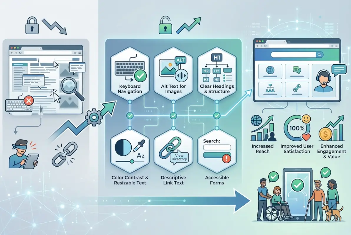
Which accessibility best practices should I start with if I’m on a tight timeline?
Focus on these high-impact quick wins first: ensure all images have meaningful alt text, verify sufficient color contrast for text and interactive elements, add proper labels to all form inputs, implement keyboard accessibility for all interactive features, establish clear heading hierarchy, add skip links for bypassing navigation, and ensure your site works without JavaScript for core tasks. These foundational improvements require minimal development effort but eliminate common barriers. Save complex ARIA patterns and custom component overhauls for phase two when you have more time and resources.
Taking Your Directory From Accessible to Exceptional
Building an accessible online directory isn’t just about checking compliance boxes—it’s about fundamentally respecting the diverse ways people interact with digital content. When you commit to accessibility, you’re choosing to design for reality instead of assumptions, for actual users instead of idealized ones.
The 12-week roadmap outlined above gives you a concrete starting point, but accessibility is an ongoing practice, not a destination. As web technologies evolve, as assistive technologies improve, and as you add new features to your directory, accessibility considerations need to remain central to your decision-making. The organizations that excel at accessibility are those that embed it into their culture and workflows rather than treating it as a specialized project.
Start with your baseline audit this week. Identify your biggest barriers—the issues that prevent users from completing core tasks. Fix those first. Then systematically work through the less critical problems. Involve users with disabilities in your testing. Listen when they tell you something doesn’t work. Iterate based on real feedback.
Ready to Build an Accessible Directory?
The difference between a directory that excludes millions of potential users and one that welcomes everyone comes down to intentional design choices and sustained commitment. You now have the framework, best practices, and roadmap to build something genuinely inclusive. The question isn’t whether accessibility matters—it clearly does. The question is whether you’ll prioritize it alongside features, performance, and business requirements. Start your accessibility audit today and take the first step toward a directory that works for everyone.
Remember that perfect accessibility is aspirational—even the most committed teams discover new issues as they learn and grow. What matters is consistent progress, genuine effort, and responsiveness when users encounter barriers. Document your commitment in an accessibility statement, establish measurable goals, and report on your progress transparently. The web should be accessible to everyone, and every directory platform that embraces that principle moves the entire ecosystem forward.
Was this article helpful?