7 Tips to Present a Large Online Directory for Better User Experience

Generating summary...
TL;DR – Quick Takeaways
- Information Architecture is Everything – Structure your directory with task-oriented categories and minimal click depth to help users find what they need fast
- Search Makes or Breaks the Experience – Invest in autocomplete, synonyms, and relevance ranking to handle thousands of listings gracefully
- Scanning Beats Reading – Design result cards with consistent metadata, clear visual hierarchy, and skimmable layouts
- Trust Signals Drive Conversions – Reviews, verification badges, and quality indicators reduce friction for both searchers and listing owners
- Performance is Non-Negotiable – Core Web Vitals and mobile speed directly impact bounce rates and SEO for large catalogs
- Measure What Matters – Track search success rate, time-to-listing, and filter usage to continuously optimize the directory experience
Here’s something most directory owners get wrong: they treat navigation like a filing cabinet when it should work like a concierge. I’ve watched small business owners give up on perfectly good directories simply because finding a local plumber meant clicking through six category levels and parsing through hundreds of irrelevant results. The irony? Those same directories had the exact listing the user needed, buried three pages deep behind poorly labeled filters.
Large online directories face a unique UX challenge. You’re not just presenting information—you’re organizing thousands (sometimes millions) of listings in a way that feels effortless to scan, trustworthy enough to act on, and fast enough to keep mobile users from bouncing. Get it right, and you create a resource people bookmark and return to. Get it wrong, and even the best catalog becomes a graveyard of abandoned searches and frustrated clicks.
This guide walks you through seven essential strategies to present large directories with clarity, speed, and conversion in mind. We’ll cover everything from information architecture that scales to onboarding flows that actually convert listing owners. Whether you’re building a local business directory, a B2B service catalog, or a niche marketplace, these patterns will help you balance feature richness with navigational simplicity.
Research Foundations and Goals for a Large Directory
Before you touch a single wireframe, you need to understand what users are actually trying to accomplish. I remember auditing a healthcare provider directory that had beautiful design but terrible task completion rates—turns out users wanted to filter by “accepts new patients” and “weekend hours,” but the directory only offered specialty and zip code. The owners had built what they thought users needed instead of researching what users actually did.
Start by mapping user journeys for your top three personas. For a business directory, that might be: the local searcher looking for “emergency plumber near me,” the researcher comparing options for a future project, and the listing owner trying to claim or update their profile. Each journey has different success criteria, and your architecture needs to accommodate all of them without creating clutter.
Understand User Tasks and Journeys
Task analysis reveals the specific actions users take to reach their goals. Use session recordings, heatmaps, and search query logs to identify patterns. What keywords do people type first? Which filters do they apply most often? Where do they abandon the search flow? These insights become the blueprint for everything from homepage design to filter placement.
One pattern I see repeatedly: users on mobile perform fundamentally different tasks than desktop users. Mobile searchers want immediate answers (phone number, hours, directions), while desktop users compare multiple options and read reviews. Your interface needs to surface different information hierarchies based on device context without feeling like two separate experiences.
Define Key Success Metrics
You can’t optimize what you don’t measure. For directories, the metrics that matter most include:
- Search precision – percentage of searches that return relevant results in the top 10
- Filter efficacy – how often applied filters narrow results to a manageable set
- Time-to-listing – seconds from landing page to viewing a specific listing detail page
- Task completion rate – percentage of sessions ending in a conversion event (call, email, booking)
- Empty result rate – how often filter combinations produce zero results (a major frustration point)
Benchmark Against Leading Directories
Study the top performers in your vertical and adjacent categories. Google Business listings set user expectations for local search, Yelp defines restaurant discovery patterns, and LinkedIn shapes professional directory behavior. You don’t need to copy them, but you do need to understand the mental models they’ve established in your users’ minds.
Create a benchmark matrix comparing navigation depth, filter options, search quality, mobile performance, and trust signals across 4-5 leading directories. This gives you realistic targets and helps you identify opportunities to differentiate where competitors fall short.
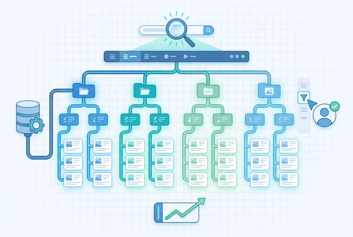
Information Architecture Tailored to Scale
Information architecture is where most large directories either win or lose the user. The challenge compounds as you grow—what worked for 500 listings creates chaos at 5,000. I’ve seen directory owners add categories organically over time, ending up with overlapping taxonomies that confuse users and dilute SEO value.
The cardinal rule: minimize cognitive load at every decision point. Users should never face a wall of 40 category options or wonder which of three similar-sounding filters applies to their search. Every additional click, every ambiguous label, every “choose one of these 15 options” moment increases bounce probability.
Global Navigation and Category Taxonomies
Structure categories around user intent, not internal business logic. A common mistake is organizing by industry taxonomy when users think in terms of problems they need solved. For example, a service directory might categorize by “Residential Contractors” and “Commercial Contractors” when users actually search for “Kitchen Remodeling” or “Office Renovation.”
Aim for 5-9 top-level categories maximum (matching human short-term memory capacity), with no more than three click levels to reach any individual listing. Use card sorting exercises with real users to validate your taxonomy before building it into the architecture. If you’re managing active directory benefits small businesses, the same principles of clear categorization apply to technical infrastructure.
| Navigation Approach | Best For | Drawbacks |
|---|---|---|
| Mega Menu | Complex catalogs with clear hierarchies | Overwhelming if poorly organized |
| Faceted Search | Large inventories with multiple attributes | Requires good default state and smart filtering |
| Location-First | Local business directories | Doesn’t work for virtual services or global catalogs |
| Tag Cloud | Discovery-focused browsing | Poor for goal-directed searches |
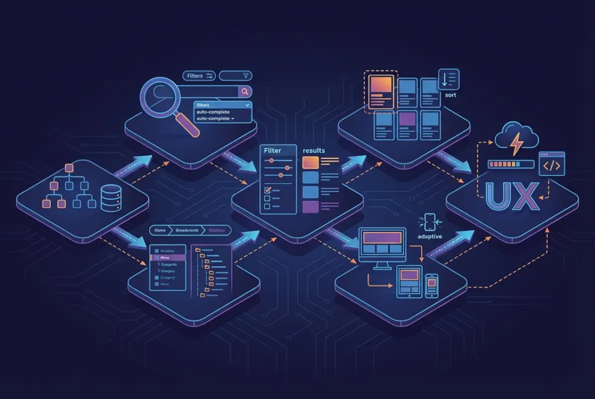
Faceted Search and Filtering Strategies
Facets are the workhorse of directory navigation, but they require careful curation. Expose the highest-value filters first—typically location, category, price/tier, and ratings. Less common filters (hours of operation, languages spoken, certifications) should collapse into an “Advanced Filters” section to avoid overwhelming the initial view.
Show result counts next to each filter option so users can predict whether a combination will produce results. Nothing frustrates users more than applying three filters only to see “0 results found.” Smart filtering systems disable impossible combinations or suggest alternatives when filters would produce empty results.
Breadcrumbs, Sitemaps, and Index Pages for Orientation
Breadcrumbs serve double duty—they help users backtrack through navigation and signal to search engines the site structure. Format them with schema markup to enable rich snippets in search results. Every listing detail page should show the full path: Home > Category > Subcategory > Location > Business Name.
Create dedicated index pages for major categories and locations. These pages serve as SEO landing pages while giving users an overview of what’s available in a specific area or category. A well-designed index page beats a filtered search results page for both user comprehension and search ranking.
Pagination vs. Infinite Scroll vs. Load More
Each approach has tradeoffs. Pagination works best for desktop users who want to bookmark specific pages or jump to results at the end. Infinite scroll feels natural on mobile but creates issues with footer access and SEO indexing. The “Load More” button splits the difference—progressive disclosure with user control.
For large directories, I recommend hybrid approaches: infinite scroll on mobile with clear loading indicators, paginated results on desktop with jump-to-page functionality. Always show the total result count and current position so users can judge whether to keep scrolling or refine their search.
Search Experience That Scales with Volume
Search is the escape hatch for users who can’t find what they need through navigation. In large directories, it’s often the primary entry point—especially for users coming from external search engines with specific intent. Your search experience needs to handle everything from vague queries (“contractors near me”) to precise lookups (“ABC Plumbing Portland OR”).

The difference between good and great directory search comes down to relevance ranking and tolerance for user error. Google has trained users to expect search that understands synonyms, forgives typos, and surfaces the most relevant results first regardless of exact keyword matches. Your directory search needs to meet those same expectations within your domain.
Fast, Relevant Search Results with Smart Ranking
Relevance algorithms should balance multiple signals: keyword match quality, listing completeness, user ratings, recency of updates, and geographic proximity. Boost verified listings and premium accounts slightly, but not so much that organic relevance suffers—users will abandon a directory that feels pay-to-win.
Consider implementing different ranking algorithms for different query types. Location-specific searches (“dentist 90210”) should prioritize proximity, while service searches (“emergency locksmith”) might weight 24-hour availability and response time higher than geographic distance.
Autocomplete, Synonyms, and Spelling Correction
Autocomplete serves three purposes: it speeds up search entry, suggests correct spelling, and educates users about what’s available in your directory. Show a mix of category suggestions, business names, and location completions in the dropdown. Highlight the matching portion of each suggestion to help users scan quickly.
Build a synonym dictionary specific to your vertical. In a home services directory, “HVAC” should match “heating and cooling,” “air conditioning,” and “furnace repair.” Medical directories need extensive synonym coverage for conditions, treatments, and specialties. This requires domain expertise but dramatically improves search success rates.
Implement fuzzy matching for typos, transpositions, and common misspellings. Track search queries that return zero results—these are gold mines for identifying gaps in your synonym dictionary and common user errors your search should accommodate.
Synced Search Across Listings and Content
Users don’t distinguish between listings, articles, and guides—they just want information. Your search should span all content types with unified ranking. A query for “choosing a contractor” might surface relevant blog posts alongside contractor listings, giving users both education and options.
Use content type indicators in search results to help users distinguish between a business listing, an article, and a category page. Clear visual differentiation prevents the frustration of clicking an article when you wanted a business phone number.
Listing Pages and Result Cards Designed for Scanning
Users don’t read directory results—they scan them. Eye-tracking studies show F-pattern scanning behavior, with attention concentrated on the top-left corner of each card and declining rapidly as users move down and right. Your result card design needs to put the most important information in that high-attention zone.
Consistency matters more than you think. When every card follows the same layout—rating in the top right, category below the title, location and hours in predictable positions—users develop a scanning pattern that accelerates comprehension. Break that consistency and you force users to slow down and parse each card individually.
Consistent, Skimmable Result Cards with Key Metadata
Every result card should answer the user’s immediate questions: What is this business? Is it relevant to my need? Is it nearby? Is it well-reviewed? Is it open now? Design cards with clear visual hierarchy that surfaces these answers at a glance.
Essential elements for most directory cards include business name (linked), primary category, star rating and review count, distance or location, phone number (click-to-call on mobile), and primary action button (view details, get directions, book now). Avoid cramming too much information into cards—save the details for the listing page.
| Card Element | Priority | Placement Recommendation |
|---|---|---|
| Business Name | High | Top left, largest text |
| Star Rating | High | Top right or directly under name |
| Location/Distance | High | Under category, with map icon |
| Price Indicator | Medium | Near rating or in metadata row |
| Photo/Logo | Medium | Left side, square aspect ratio |
| Description Snippet | Low | Bottom of card, 1-2 lines max |
Persuasive Yet Concise Listing Information
Listing detail pages need to balance comprehensiveness with scannability. Use progressive disclosure—show essential info above the fold, with additional details accessible through tabs or expand/collapse sections. Common sections include About, Services, Reviews, Photos, Location/Hours, and Contact.
Reviews deserve special attention, they’re often the deciding factor between clicking “Call Now” or returning to search results. Surface the most helpful reviews (based on user votes), show verified purchase indicators where applicable, and allow sorting by recency and rating. Display response rate for businesses that engage with reviews—it signals active management.
Visual Hierarchy and Typography for Dense Results
Typography carries massive UX weight in directories. Use size, weight, and color to establish clear hierarchy within each card. Business names should be 16-18px (1em-1.125em) and bold, categories 14px (0.875em) in a muted color, metadata 12-13px (0.75em-0.8125em). Maintain sufficient contrast ratios for accessibility (minimum 4.5:1 for body text).
White space prevents dense results from feeling overwhelming. Padding within cards and margin between cards creates breathing room that actually improves scanning speed. Resist the temptation to cram more listings above the fold by reducing spacing—it backfires by making results harder to parse. Understanding tips make online directory web accessible users disabilities will guide you toward better visual design patterns.
Rich Snippets and Schema Markup
Implement LocalBusiness or Organization schema markup on every listing page. This enables rich snippets in search results—star ratings, price ranges, hours, and location information displayed directly in Google results. Rich snippets improve click-through rates and signal to search engines that your directory provides structured, high-quality data.
Use BreadcrumbList schema for navigation trails, AggregateRating for review summaries, and FAQPage schema for common questions on listing pages. Validate all markup with Schema.org testing tools before deployment to catch errors that could prevent rich results from displaying.
Onboarding and Trust Signals
Trust determines whether users act on information they find in your directory. A listing might be perfectly relevant, but if users doubt its accuracy or legitimacy, they’ll return to Google for verification. Trust signals need to be obvious, consistent, and earned through verification processes users understand.

The cold start problem hits directories especially hard—new listings have no reviews, established businesses may not have claimed their profiles yet, and users question whether information is current. Your onboarding flow needs to solve for listing quality while keeping friction low enough that businesses actually complete the process.
Clear Value Proposition and Quick Onboarding for New Listings
Business owners evaluating whether to claim a listing or create a new one need to understand the value immediately. Quantify the benefit: “Claimed listings receive 5x more inquiries” or “Connect with 50,000 monthly searchers in your area.” Show social proof—how many businesses have already joined, testimonials from successful listings.
The signup flow should request only essential information upfront. Get the business online with name, category, location, and contact info, then prompt for additional details (photos, services, hours) through a post-signup wizard. Every additional required field before submission increases abandonment.
Verification, Reviews, and Quality Signals
Verification badges build trust, but only if the verification process is rigorous and transparent. Common methods include phone verification (automated call to business number), postcard verification (mail code to physical address), or document upload (business license, tax ID). Display what verification means in plain language—users need to know what that checkmark actually guarantees.
Review systems require moderation to maintain credibility. Implement fraud detection for fake reviews (velocity checks, duplicate content detection, suspicious patterns), display both positive and negative reviews (all 5-star profiles feel fake), and allow businesses to respond publicly. Show review dates and reviewer history (one-time reviewer vs. community contributor).
Additional quality signals include profile completeness indicators, response time/rate badges for businesses that answer inquiries quickly, years in business, licenses and certifications, and membership in professional organizations. Layer these signals throughout the listing without creating visual clutter.
Accessibility as a UX Requirement
Accessibility isn’t a nice-to-have feature, it’s a baseline requirement that expands your audience and improves experience for everyone. Screen reader users, keyboard navigators, users with low vision or color blindness, and those on assistive devices all depend on accessible design to use your directory effectively. Implementing tips make online directory web accessible users disabilities 2 ensures you’re serving all potential users.
Semantic HTML forms the foundation—use proper heading hierarchy, landmark regions, and ARIA labels where HTML semantics fall short. Every interactive element must be keyboard accessible with visible focus indicators. Images need descriptive alt text (especially for business logos and photos), and color can’t be the only way to convey information (use icons + text, not color alone).
Performance, Accessibility, and Reliability at Scale
Performance problems compound as directories grow. A half-second delay that’s barely noticeable with 100 listings becomes intolerable with 10,000. Mobile users on slower connections suffer most—they’re also your highest-intent audience, searching for immediate local solutions. Core Web Vitals directly impact both user experience and search rankings.
Core Web Vitals and Fast Mobile Experience
The three Core Web Vitals measure loading (Largest Contentful Paint), interactivity (First Input Delay), and visual stability (Cumulative Layout Shift). For directories, LCP often struggles with hero images or maps loading slowly, FID suffers from heavy JavaScript frameworks, and CLS happens when ads or images load after initial render.
Target LCP under 2.5 seconds, FID under 100ms, and CLS under 0.1. Achieve this through image optimization (WebP format, responsive images with srcset, lazy loading below fold), code splitting (load only JavaScript needed for current view), and CSS that prevents layout shifts (reserve space for dynamic content with aspect ratio boxes).
WCAG-Aligned Keyboard Navigation
Every user flow must work with keyboard alone—no mouse required. Tab order should follow visual order, skip links should allow jumping to main content, and focus traps (like modal dialogs) must be escapable with the Escape key. Test your directory by unplugging your mouse and completing core tasks using only keyboard.
Interactive elements need clear focus indicators (the default blue outline works, custom focus styles should be even more visible). Dropdown menus and filters should work with arrow keys, Enter to select, and Escape to close. Search autocomplete should be navigable with arrow keys and accessible to screen readers via ARIA live regions.
Efficient Media and Lazy Loading Strategies
Business photos and logos add visual interest but can destroy page weight if not optimized. Implement lazy loading for all images below fold (use native loading=”lazy” attribute or JavaScript intersection observers). Serve responsive images sized appropriately for each device—mobile users don’t need your 2MB hero image.
Consider using a CDN for media assets to reduce latency. Cloudflare, AWS CloudFront, or specialized image CDNs (Imgix, Cloudinary) automatically optimize and resize images based on device and connection speed. The investment pays for itself in improved Core Web Vitals and reduced bounce.
Monitoring, Uptime, and Graceful Degradation
Large directories depend on multiple services—database, search index, map API, payment processor, email delivery. When any component fails, the entire experience shouldn’t collapse. Implement graceful degradation: if search is down, navigation still works; if maps fail, show text address; if reviews API times out, display cached ratings.
Monitor real user metrics through RUM (Real User Monitoring) to catch performance degradations in production. Set up alerts for uptime, error rates, and Core Web Vitals thresholds. Track key user flows (search, listing view, contact submission) with synthetic monitoring to detect breakage before users complain.
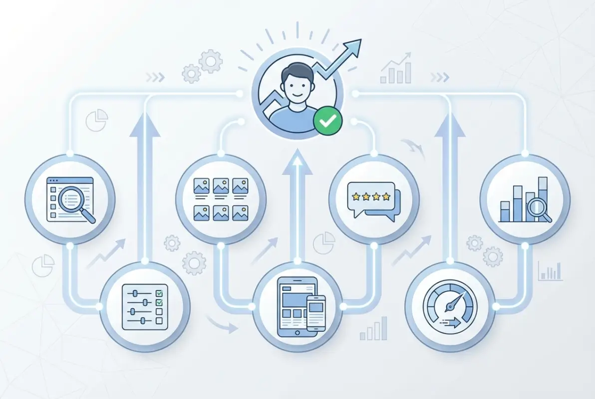
Analytics and Optimization for Large Directories
Data separates guesswork from strategic decisions. Every hypothesis about user behavior—which filters matter, how many results to show per page, whether users prefer list or map view—should be testable through analytics. The larger your directory, the more statistical power you have to run meaningful experiments.
Metrics to Track
Beyond standard analytics (sessions, bounce rate, conversions), directories need specialized metrics that reveal UX quality. Task success rate measures how many sessions end in desired actions (call, email, booking, save). Search success rate tracks searches that result in clicking a listing versus refinement or abandonment.
Filter usage reveals which facets actually help users narrow results. If 80% of users apply location and category filters but only 3% use your carefully crafted “years in business” filter, that’s signal about what matters. Time-to-listing (seconds from landing to viewing a listing detail page) indicates navigation efficiency.
Empty result rate is critical—track filter combinations that produce zero results so you can adjust taxonomy, add listings to underserved categories, or suggest alternatives. Users who hit empty results once might refine their search, hit it twice and they’re bouncing.
A/B Testing and Usability Testing at Scale
With sufficient traffic, A/B test everything: card layouts, search algorithms, filter organization, CTA button placement. Run tests long enough to achieve statistical significance (usually 2-4 weeks for directional insights). Segment results by device, traffic source, and user type—mobile and desktop often respond differently to the same change.
Quantitative data tells you what happens but not why. Supplement A/B tests with qualitative research: moderated usability tests with 5-8 users per persona, session recordings of actual user behavior, exit surveys asking why users left without completing tasks. The why often reveals opportunities quantitative data misses.
Usage Data Enrichment to Inform IA
Search query logs reveal the vocabulary users actually employ versus your internal taxonomy. If users search for “emergency plumber” but your category is “24-Hour Plumbing Services,” that’s a disconnect to fix. Query patterns also surface demand for categories you don’t currently offer.
Click patterns show which result positions get attention. If position 1-3 receive 75% of clicks, your search ranking algorithm is working. If clicks are evenly distributed across all positions, ranking likely needs improvement. Session flow analysis reveals unexpected user paths—maybe users browse categories first, then search, or vice versa—informing homepage layout priorities.
Governance, Scale, and Maintenance
Directories require ongoing curation that most founders underestimate. Listings go out of date, spam submissions slip through, categories evolve, and user expectations shift. Without governance processes, quality degrades until the directory becomes unreliable—and users notice quickly.
Design Systems and Component Libraries for Consistency
As directories grow, maintaining visual and functional consistency across thousands of pages becomes impossible without systems. Build a component library (using tools like Storybook, Pattern Lab, or native design system documentation) that defines how cards, filters, buttons, and forms should look and behave.
Document not just the what but the when—usage guidelines for each component explaining when to use a full-width CTA versus an inline link, when cards should include images versus text-only display. This enables multiple developers and designers to contribute while maintaining coherent experience.
Content Governance and Moderation Workflows
User-generated content (reviews, photos, Q&A) adds value but requires moderation. Implement automated flags for inappropriate content (profanity, competitor mentions, suspicious links) plus human review queues for borderline cases. Response time SLAs matter—reviews sitting unmoderated for weeks signal neglect.
For business listings, establish update workflows that balance freshness with verification. Allow businesses to update their own profiles (hours, services, photos) with changes going live immediately for claimed/verified listings or entering review queue for unclaimed ones. Flag listings with outdated information (no updates in 12+ months) for verification.
Regulatory Compliance and Privacy
Directories often process personal data (user accounts, reviews, contact submissions) requiring GDPR, CCPA, or local privacy law compliance. Implement cookie consent, data export/deletion tools, and transparent privacy policies explaining what data you collect and why. This isn’t just legal compliance, it builds trust.
If your directory serves regulated industries (healthcare, financial services, legal), additional requirements apply. Medical provider directories may need HIPAA considerations, legal directories might require bar association compliance, financial advisors often need SEC registration verification. Understanding specialized frameworks like ways businesses can leverage active directory can inform your compliance approach.
Frequently Asked Questions
What makes a large directory easy to use?
Easy-to-use directories minimize click depth, offer intuitive category structures, provide powerful but simple filtering, deliver fast and relevant search results, and maintain consistent design patterns across all pages. Most importantly, they surface the information users need (ratings, location, contact details) without forcing unnecessary navigation or scrolling.
How should I organize categories and filters in a large directory?
Organize categories around user tasks and intent rather than internal business logic. Keep top-level categories to 5-9 options, limit navigation depth to three clicks maximum, and expose the most valuable filters first (typically location, category, and ratings). Show result counts next to filter options and disable combinations that would produce empty results.
How can I improve search relevance in a directory with many listings?
Implement autocomplete with synonym support, fuzzy matching for typos, and relevance ranking that balances keyword match, listing completeness, ratings, recency, and geographic proximity. Different query types (location-specific versus service searches) should use optimized ranking algorithms. Track empty search results and refine synonym dictionaries based on real user queries.
What onboarding UX patterns reduce friction for new listings?
Start with minimal required fields (name, category, location, contact), show a preview before requiring signup, clearly communicate value proposition with quantified benefits, and use progressive disclosure for additional details after initial submission. Post-signup wizards or completion prompts work better than long upfront forms.
How important are trust signals like reviews and verification for directories?
Extremely important—trust signals often determine whether users act on listings or return to Google for verification. Implement visible verification badges with clear explanations, display both positive and negative reviews, show business response rates, and surface additional quality indicators like years in business and professional certifications throughout listing pages.
How do I balance performance with a feature-rich directory?
Prioritize Core Web Vitals through image optimization (lazy loading, WebP format, responsive sizing), code splitting to load only needed JavaScript, and CSS that prevents layout shifts. Use CDNs for media, implement caching strategies, and design for progressive enhancement so core functionality works even on slow connections or older devices.
What accessibility patterns should I prioritize for a large catalog?
Start with semantic HTML and proper heading hierarchy, ensure all interactive elements work with keyboard navigation, maintain WCAG-compliant color contrast ratios, provide descriptive alt text for images, and test with screen readers. Skip links, visible focus indicators, and ARIA labels for complex interactions are essential for navigating large result sets.
How should I handle pagination versus infinite scroll on large result sets?
Use hybrid approaches based on device and user preference: infinite scroll on mobile with clear loading indicators and total result counts, traditional pagination on desktop with jump-to-page controls. Alternatively, “Load More” buttons split the difference by providing progressive disclosure with user control. Always preserve back-button functionality and allow bookmarking specific result pages.
What metrics matter most in evaluating directory UX?
Track search success rate (queries resulting in listing clicks), task completion rate (sessions ending in conversions), time-to-listing (speed of reaching detail pages), filter usage patterns, empty result frequency, and Core Web Vitals. Segment all metrics by device, traffic source, and user type to identify specific pain points in the experience.
How can I ensure content stays fresh and useful in a large directory?
Implement governance workflows for user-generated content moderation, flag outdated listings (no updates in 12+ months) for verification, encourage businesses to claim and actively manage profiles, and track data freshness metrics. Automated quality signals (response rates, update frequency) help surface actively maintained listings while identifying stale content for review.
Final Thoughts: Building Directories Users Trust and Return To
Large directories succeed when they make the complex feel simple. Your users don’t care about your database architecture or how many listings you’ve amassed—they want to find the right plumber, dentist, or consultant in under a minute without questioning whether the information is accurate. Every design decision should serve that goal.
The patterns we’ve covered aren’t theoretical exercises, they’re battle-tested solutions to problems every growing directory faces. Information architecture that works for hundreds of listings breaks at thousands. Search that feels adequate with limited data becomes frustrating with comprehensive catalogs. Trust signals that were nice-to-have features become conversion requirements as competition increases.
Start with the fundamentals: clean taxonomy, fast search, skimmable cards, and obvious trust signals. Measure what matters—search success, task completion, time-to-listing—and optimize relentlessly based on real user behavior. Build governance processes before you need them, because cleaning up a degraded directory is ten times harder than maintaining quality from the start.
The best directories feel effortless because someone sweated the details behind the scenes. Category logic that makes intuitive sense, search that reads users’ minds, filters that narrow without overwhelming, cards that surface exactly what’s needed—none of this happens by accident. It requires understanding your users deeply, measuring their behavior honestly, and iterating continuously. Understanding approaches like windows small business server include active directory can inform technical implementation choices that support great UX.
Your directory competes not just against other directories but against search engines, social platforms, and whatever new discovery mechanism launches tomorrow. The defensible advantage isn’t features—it’s experience. Build something users trust enough to bookmark, remember, and recommend, and you’ve created real value that scales beyond your listing count.
Was this article helpful?